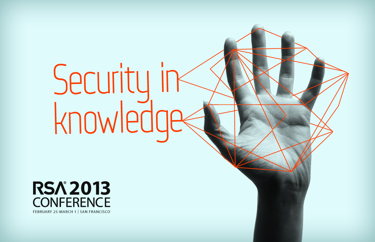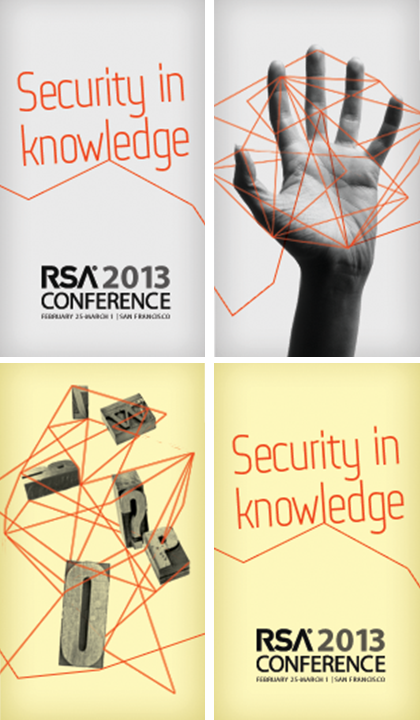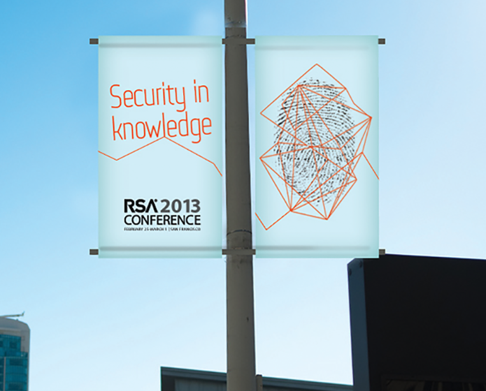
2011 – 2013
RSA Conference is the leading cryptography and information security conference held annually in San Francisco, China, Japan, and Europe. Each annual conference leads with a unique topic requiring a thematic concept and visual identity.
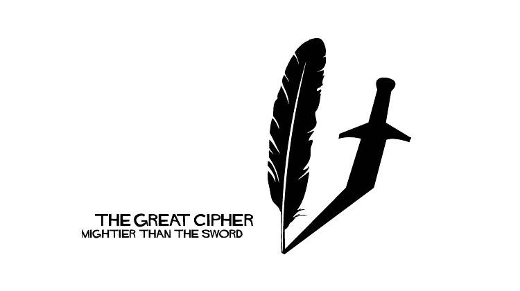
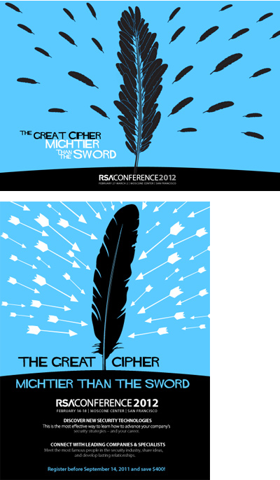
The “Mightier than the Sword” theme was developed as the identity for the conference and extended into a multi-channel marketing campaign spanning over twelve month. I oversaw the design of the core campaign and art direction for all on / offline marketing collateral. To maintain brand consistency, I wrote an extensive style guide distributed across multiple production companies responsible for conference setup and videos.
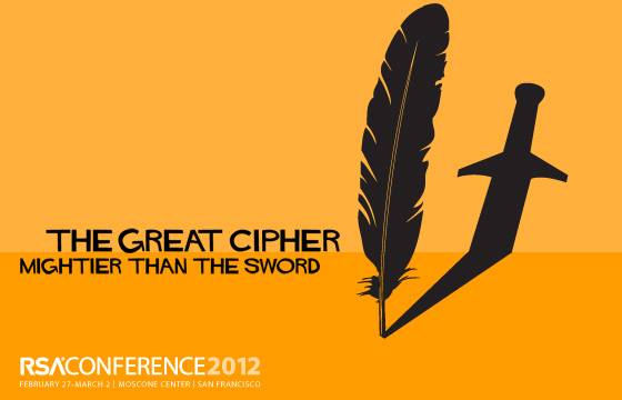
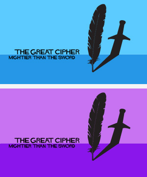
As the Art Director and Creative Lead, I led our team of a content strategist and three designers, to define “The Great Cipher: Mightier than the Sword” theme. The idea was based on the Great Cipher or Grand Chiffre developed by the Rossignols, several generations of whom served the French Crown as cryptographers. The Great Cipher was so named because it was reputed to be unbreakable. Additionally, Rossignol in French means “nightingale.” As a result, we centered the theme on the motif of the quill, a feather to write codes that allowed the French crown to defeat its enemies.
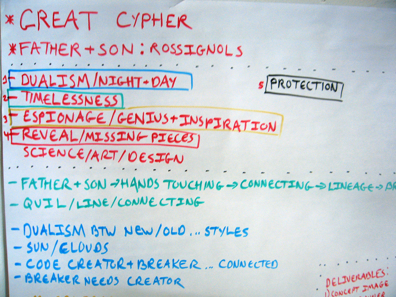
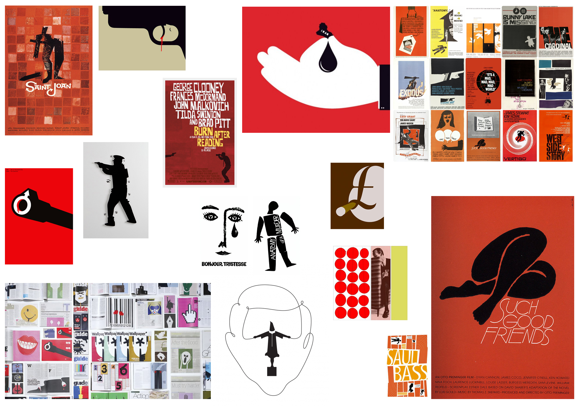
Developed 20+ theme concepts – taglines and art direction with a content strategist, two visual designers, and myself as creative lead.
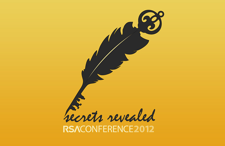
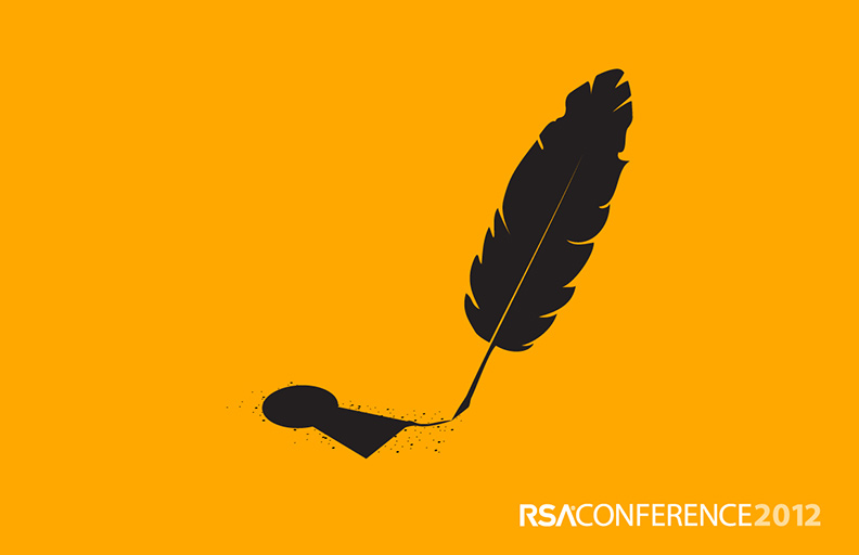
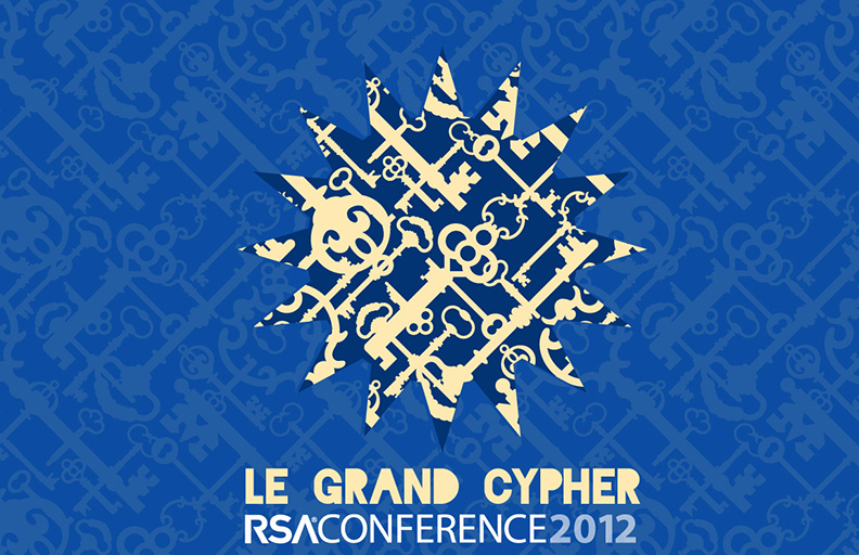
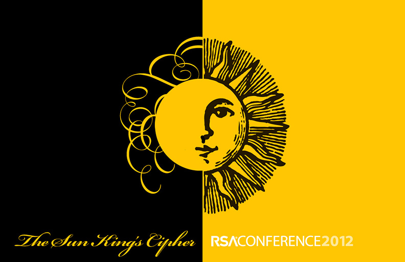
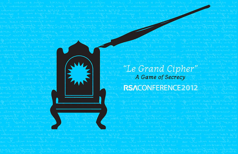
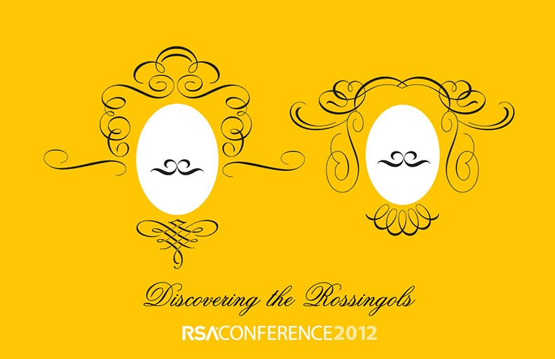
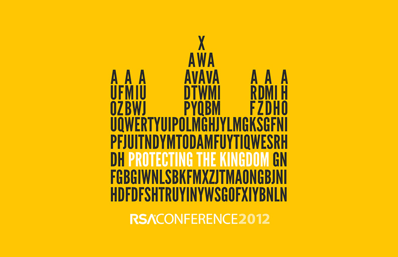
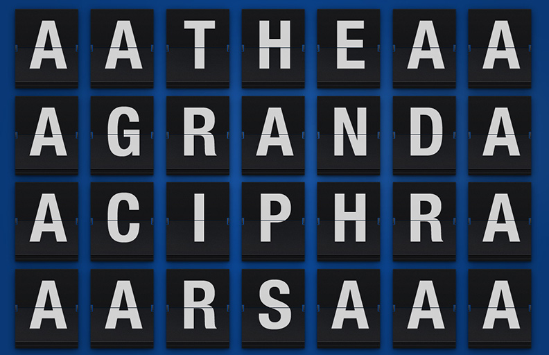
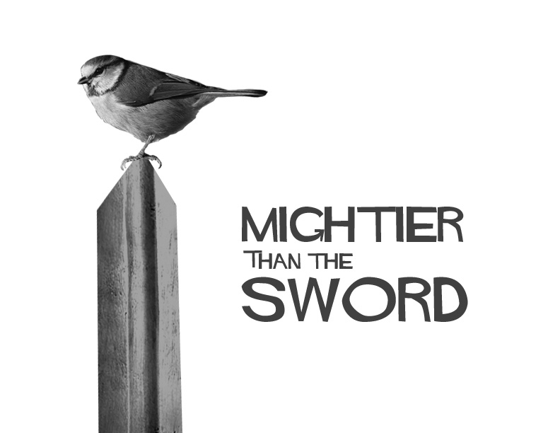
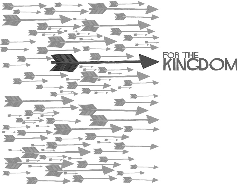
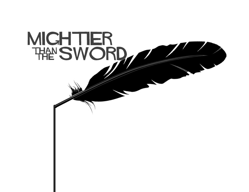
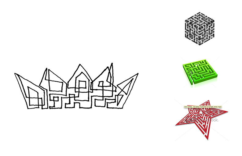
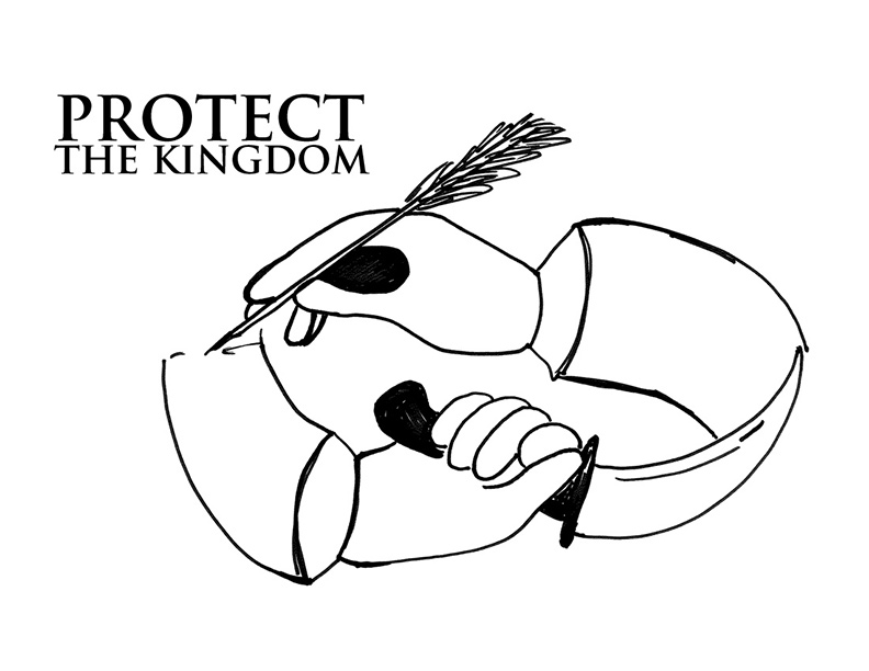
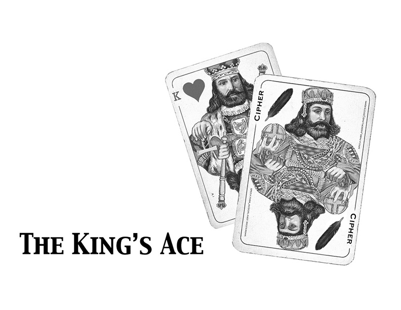
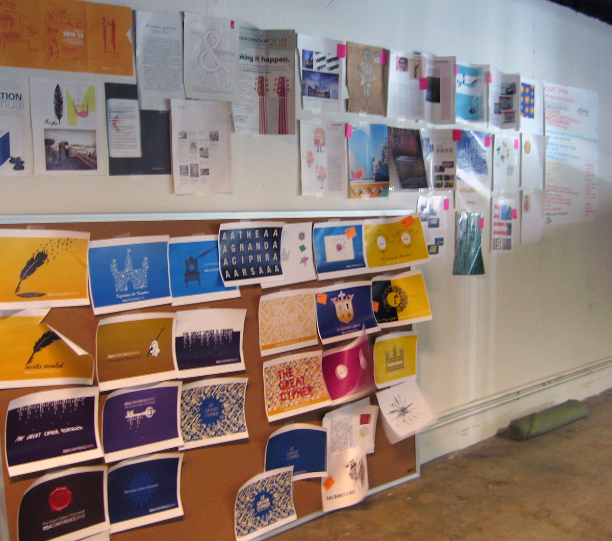
We refined twenty ideas to ten concepts that we developed into visual treatments. Each idea was extended into two pieces conference collateral.
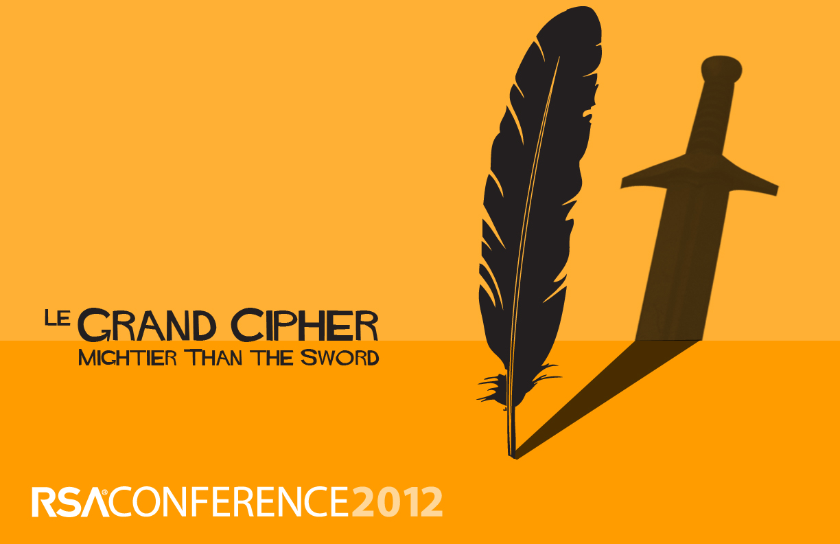
“Mightier Than The Sword”
This concept juxtaposes the quill (weapon of the coder) with the sword (weapon of the king’s enemies) to communicate how the intelligence of the Rossignols ultimately defeated the invading Huguenots. As information security professionals, conference attendees will relate to the idea of danger lurking in the shadows. Just as in King Louis XIV’s time, organizations have to be cunning (quill) to keep out threats (sword), hence the idea of the pen being mightier than the sword.
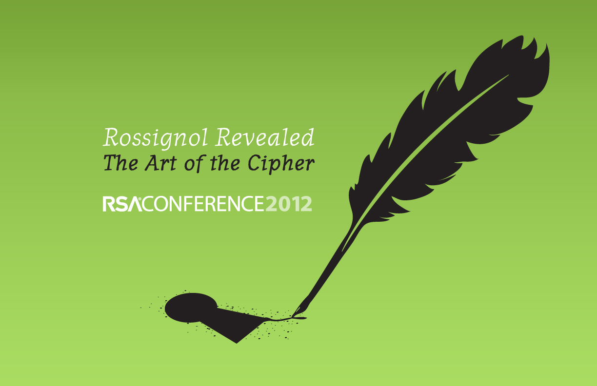
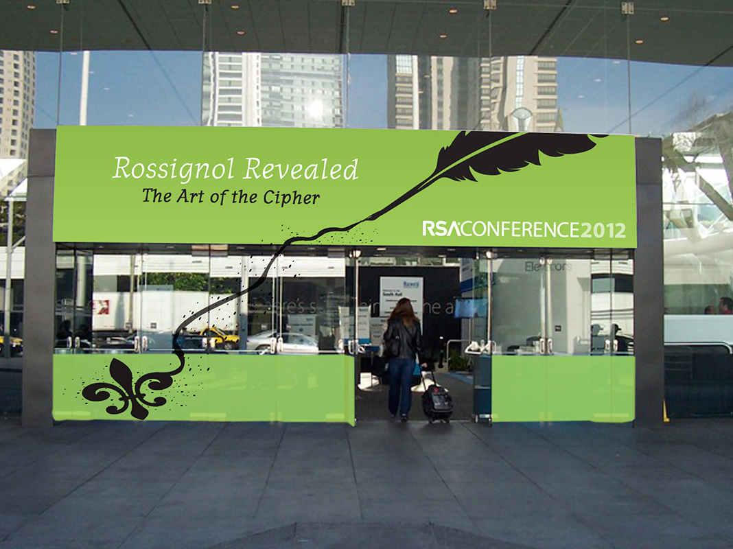
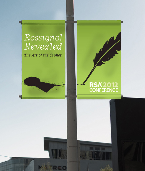
“The Art of The Cipher”
In this concept, the quill represents the code- breaker, who must apply his/her intelligence and innovation to the challenge of the cipher. We can show the quill “drawing” different things related to the Rossignol story. Here, for example, the quill creates the keyhole, i.e., the channel through which a cryptologist penetrates the cipher. Elsewhere, the quill could draw the eur de lys or sunburst to link these elements together.
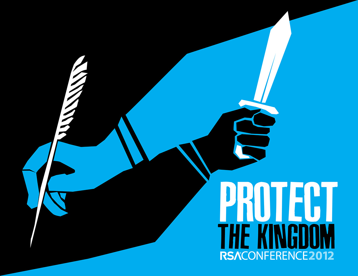
“Protect The Kingdom”
The interplay between code-maker and code- breaker is a never-ending cycle, as represented by the hand with the quill “chasing” the hand with the sword and vice-versa. Just as the Rossignols protected the king from his enemies’ swords, today’s infosec professionals are responsible for always staying one step ahead of cyber threats. The modern treatment of this concept brings old and new together in a bold way.
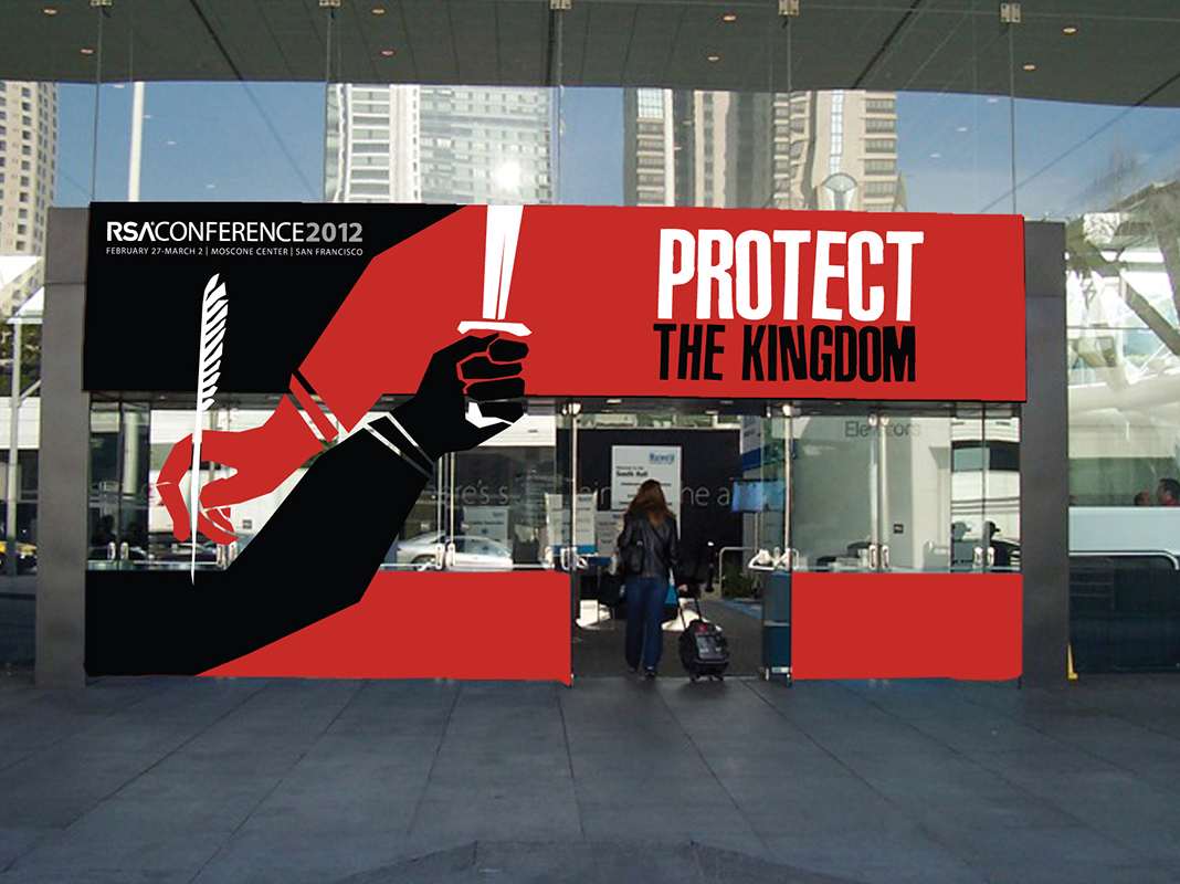
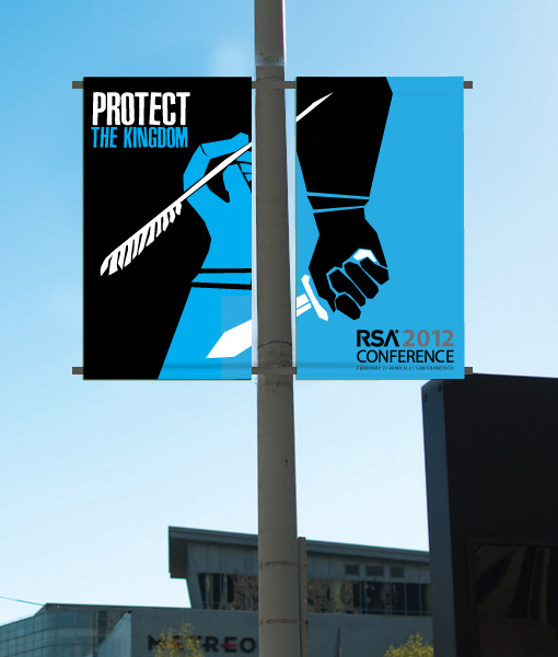
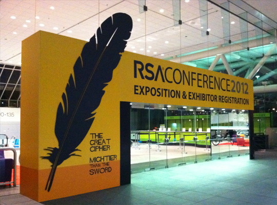
Once the theme was selected, the next step was to build out the RSA Conference 2012 Identity System. The deliverable was an extensive brand guide for voice and visual design as multiple subcontractors were responsible for the production of various conference components. Conference color palette was set as three colors to define the three primary phases of the conference.

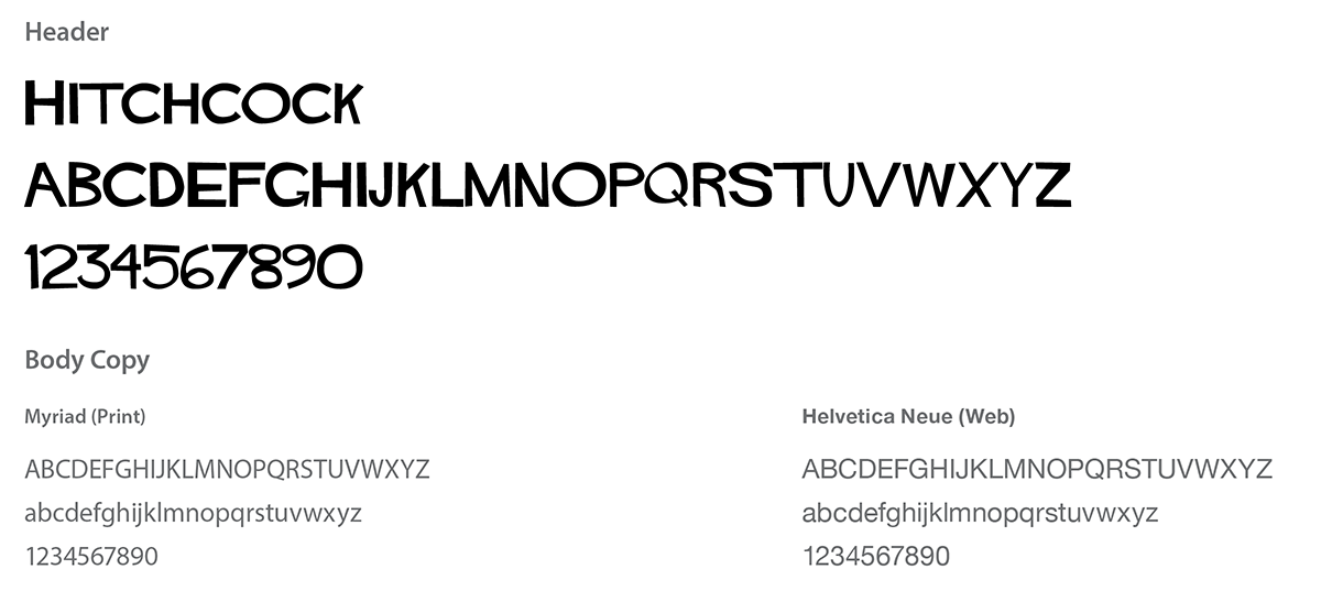
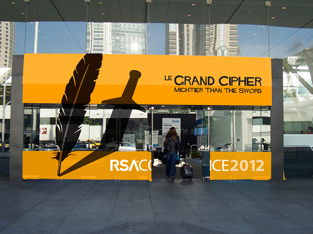
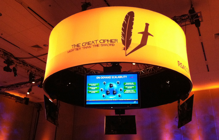
Designed identity system for all conference signage and material. Photos from Moscone Center.
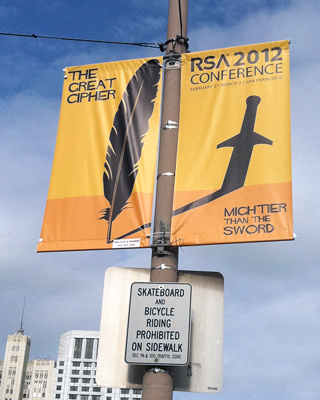
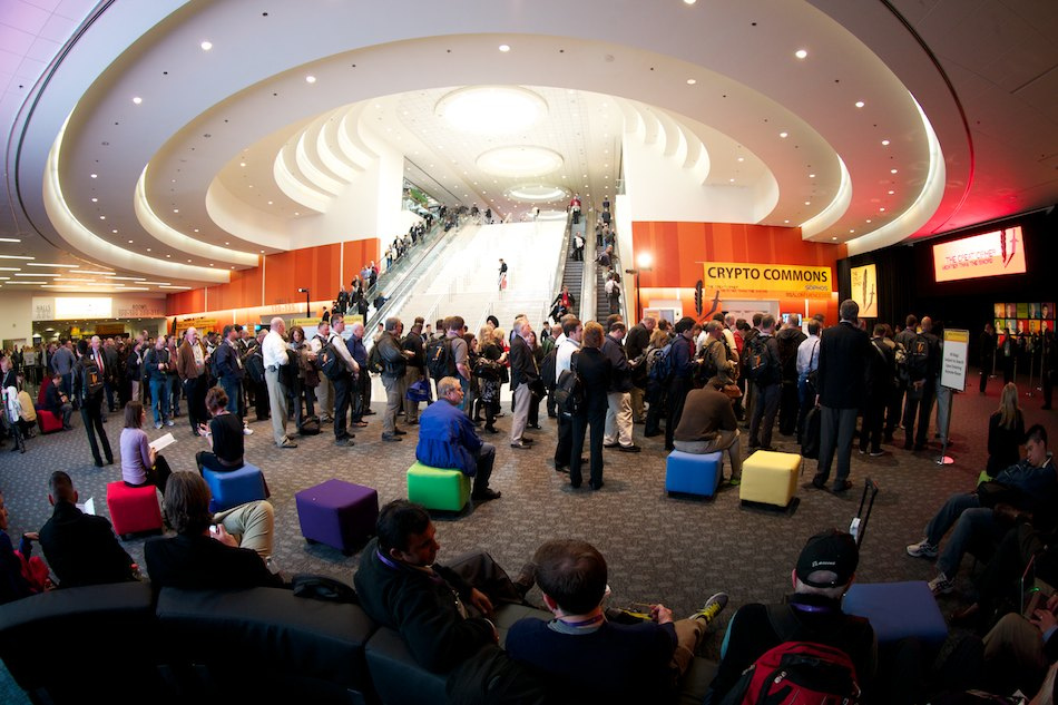
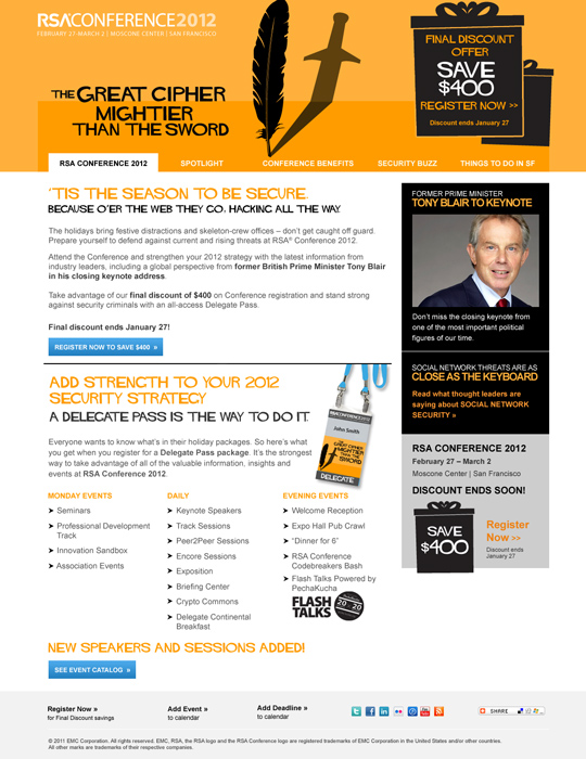
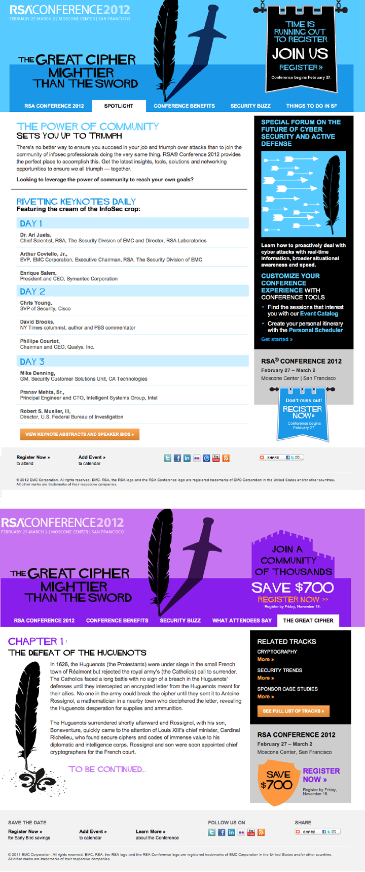
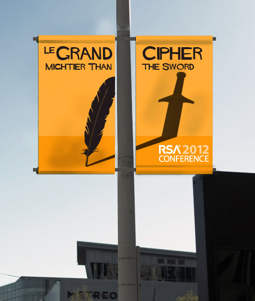
Variations on the theme per marketing campaign
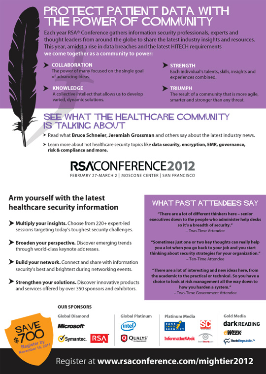
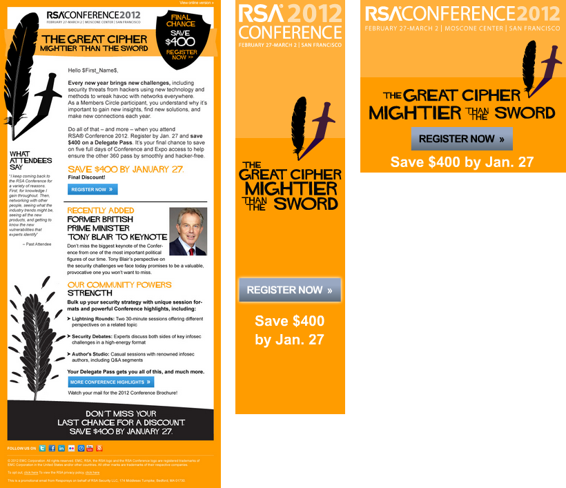
The 2012 RSA Conference was the highest selling conference to date as a result of the marketing campaign. In return we got the honor to create the campaign for the 2013 RSA Conference.
