
2015 – Current
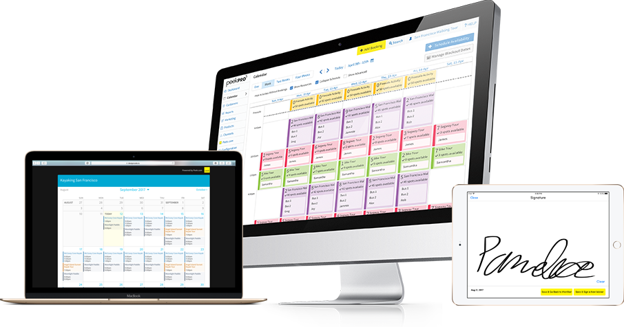
In three years, I led the design of Peek Professional from a single customer to the leading SaaS platform for tour and activity operators.
I co-developed product strategy to grow Peek Pro from an online booking widget to an ecosystem of B2B & B2C browser and iOS apps.
I did it with a small team of designers and product managers:

Tour and activity operators are diverse businesses that simultaneously require broad and vertical-specific solutions. My job as design director is to find common points that unite our operators and thread a solution to meet their needs.
No matter big or small, all operators need to increase revenue by:
To increase revenue, operators need to sell more activities and accessories. Websites are becoming the primary way customers research and try to book activities. As such, we created multiple features to allow operators to capture more revenue.
For operators, we designed a consumer friendly and modular booking widget to embed on their websites. Operators can embed the widget in three flavors:
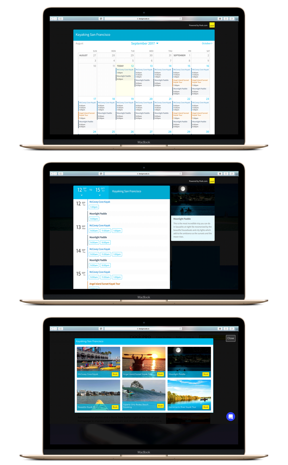
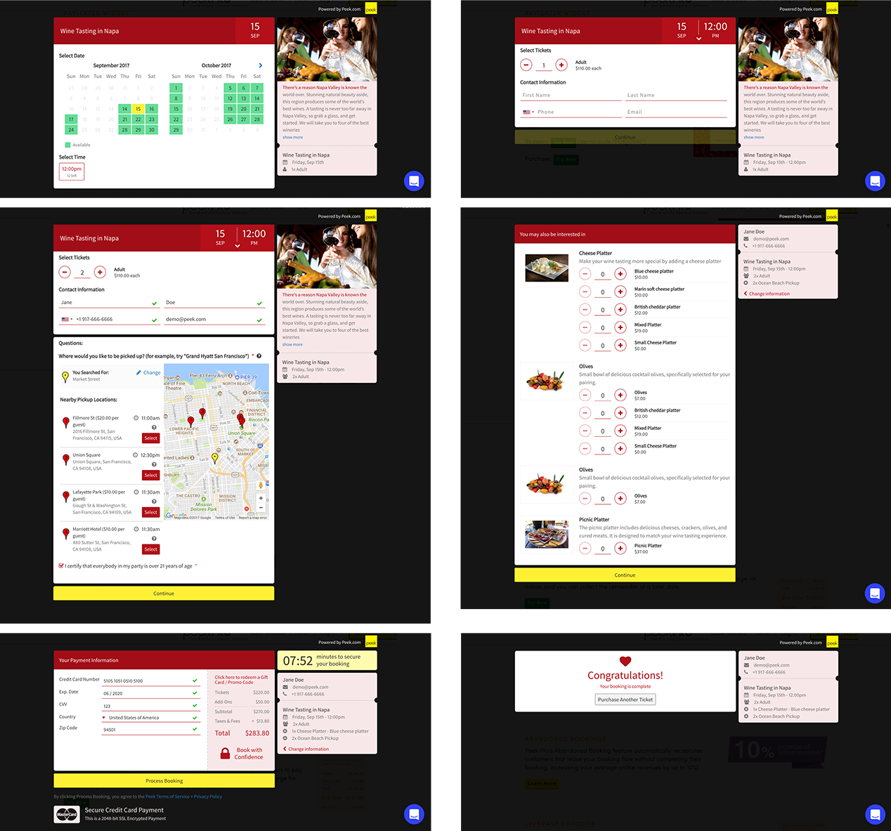
Through competitive analysis, user research, and constant A/B testing we designed our booking flow to maximize conversions by emphasizing:
The core use case of choosing date, time, tickets, and payment with add-ons, pickup locations, and up-selling activities.

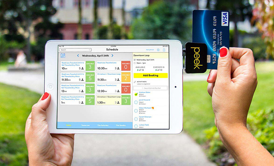
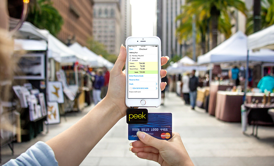
Operators also have walkup customers, for that use case we designed native iPhone and iPad apps to streamline walkups and selling accessories on the spot.
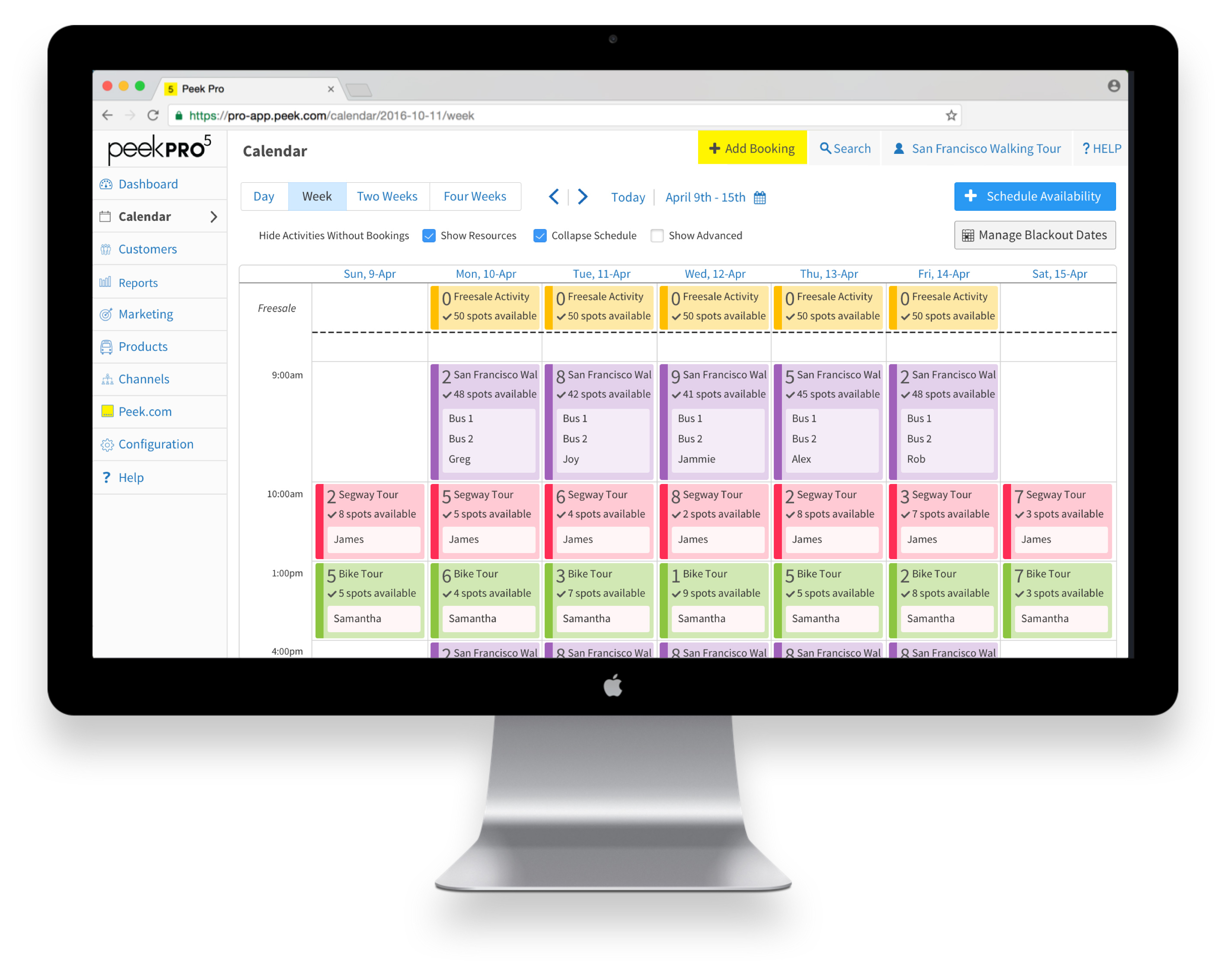
Peek Pro is designed to save operators money by integrating all aspects of the back-office into a single platform. A sample of requirements:
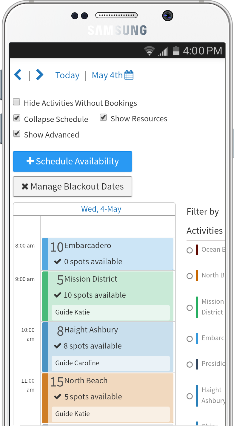
Scheduling is the core of a tour and activity business. Operators need to schedule activities, assign employees, and review bookings. Since the scheduler has to do a lot of heavy lifting, it's critical for it be intuitive. I led UX design to be based on a familiar UI, Google Cal.
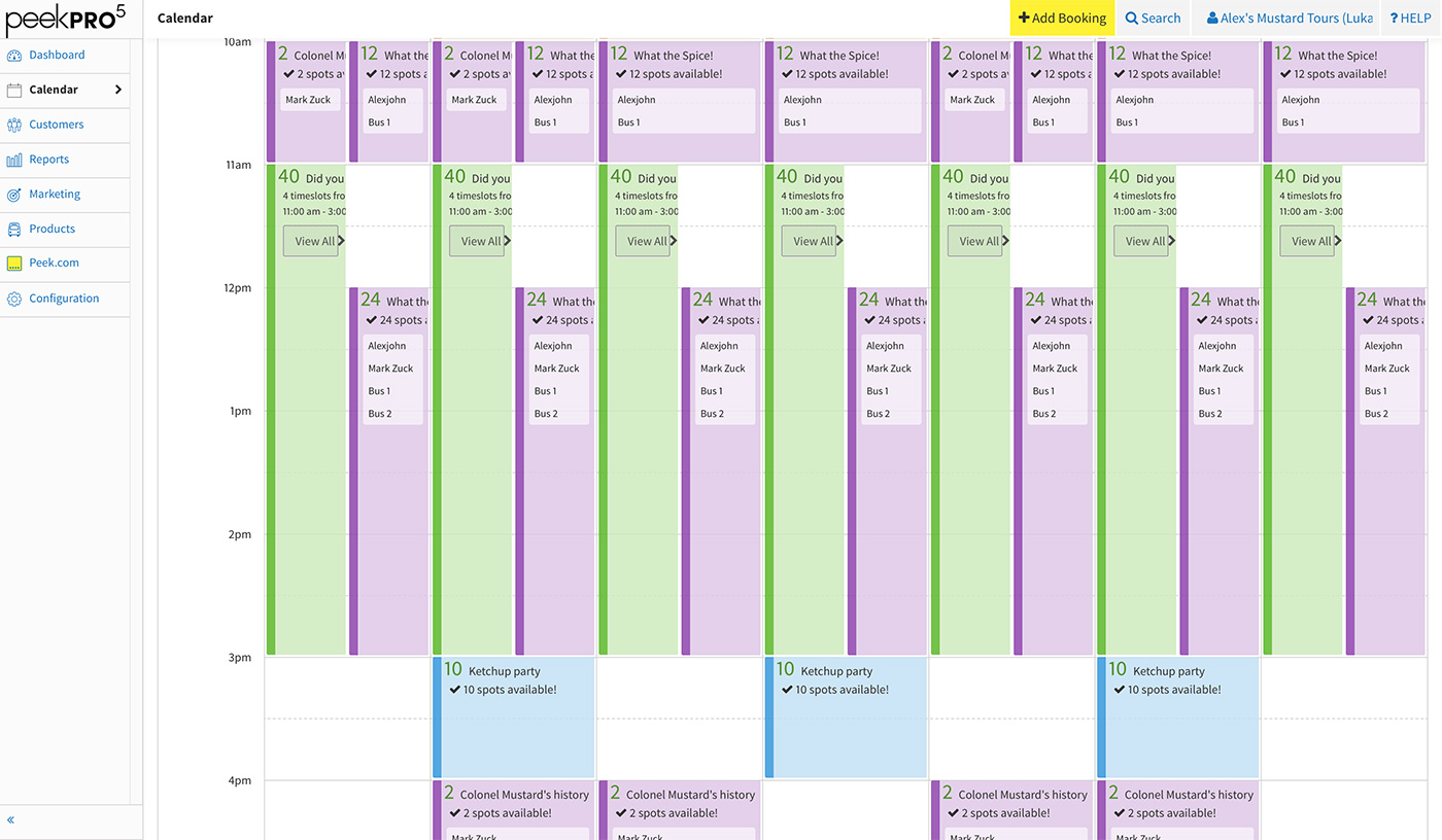
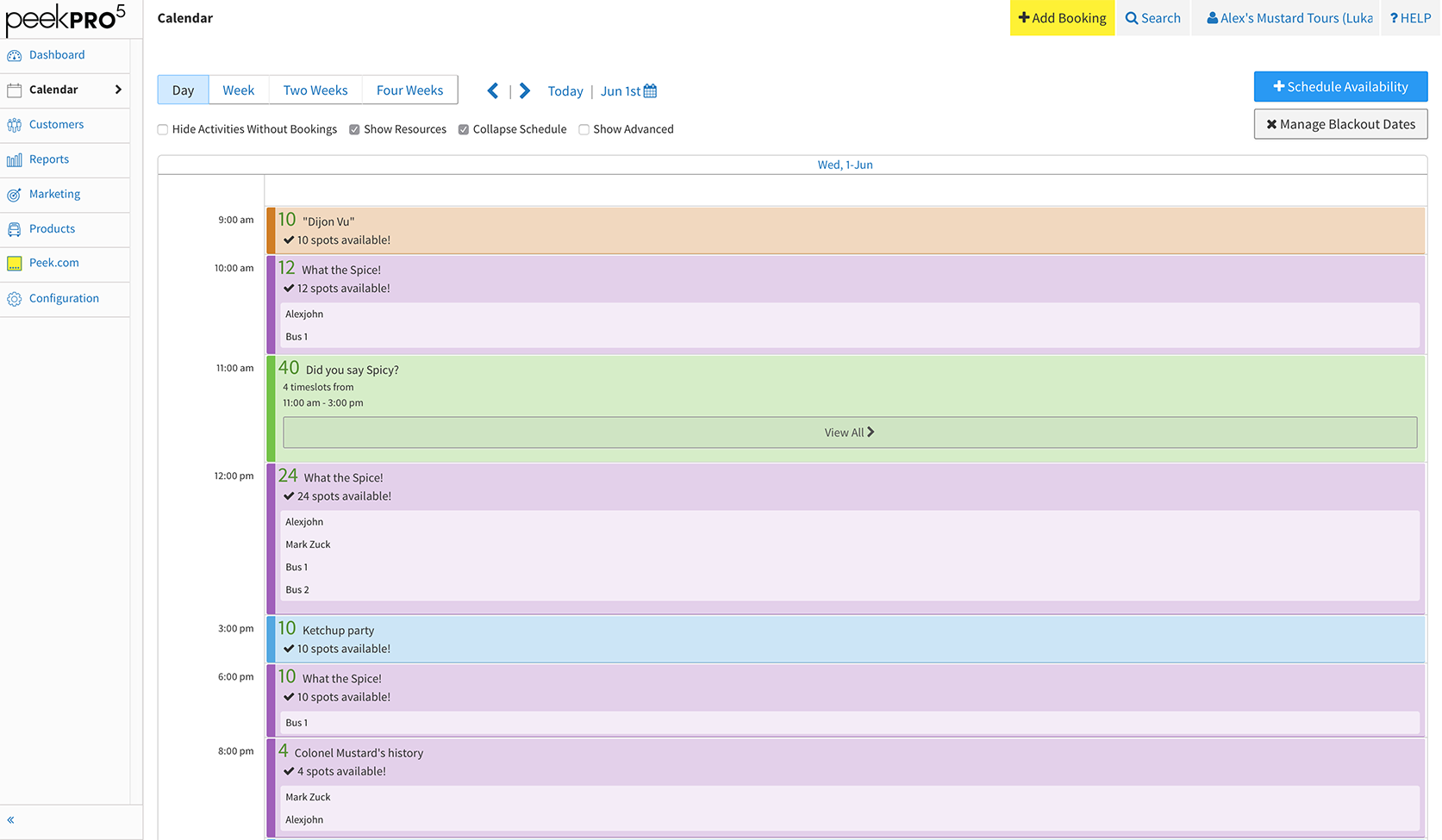
My design philosophy for Peek Pro is to be opinionated about UX but allow a user to customize views. In the below example an operator can switch between two differing booking layouts on the same calendar.
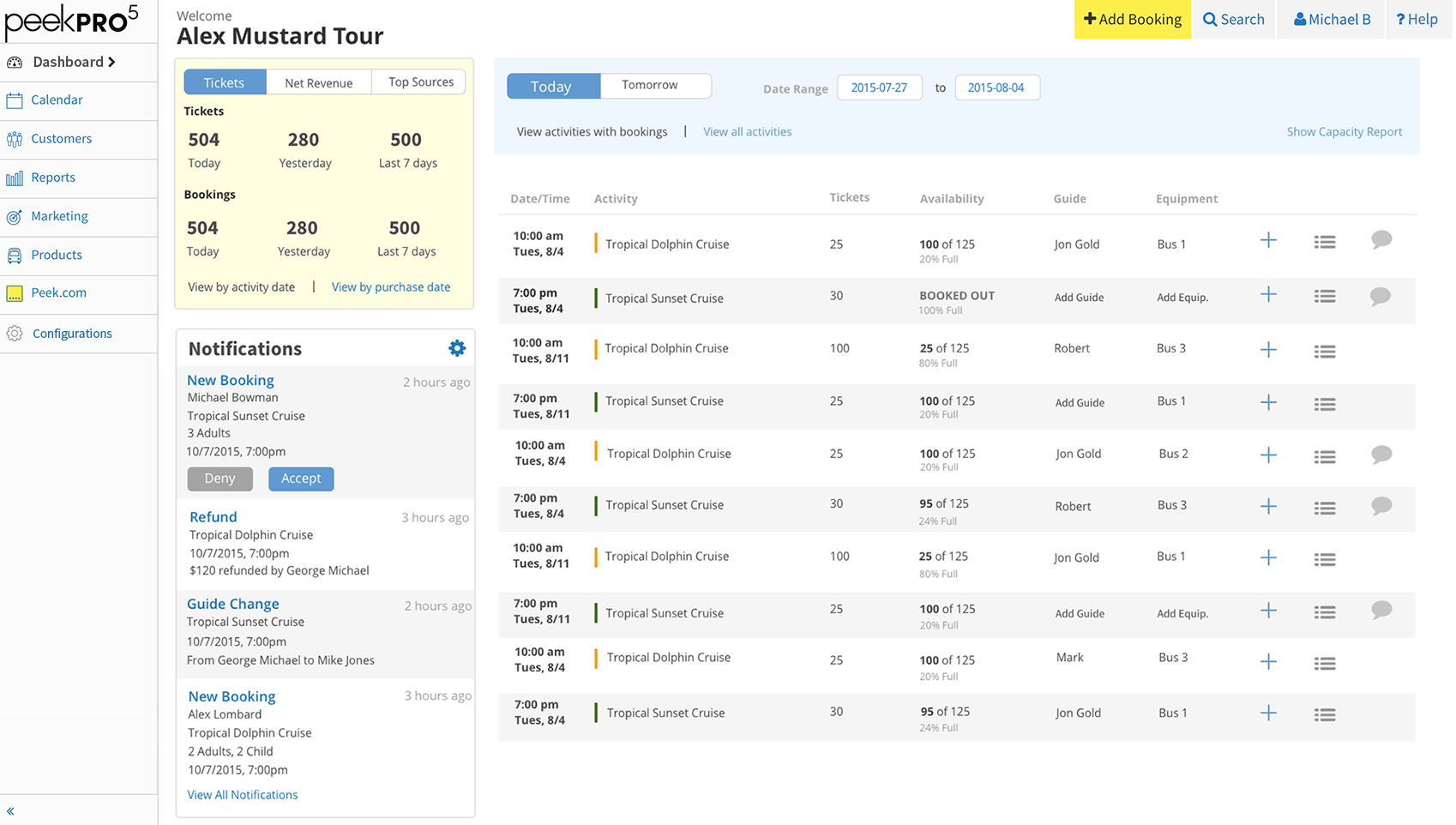
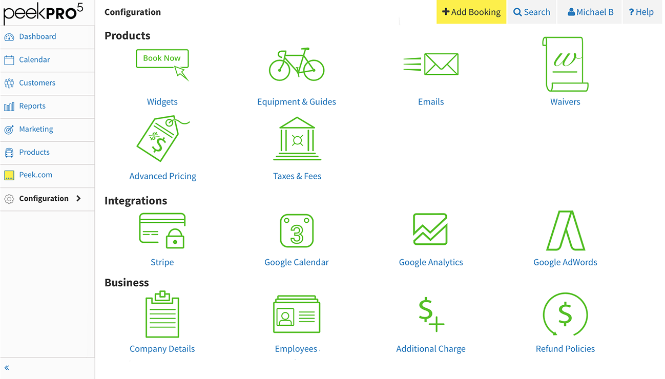
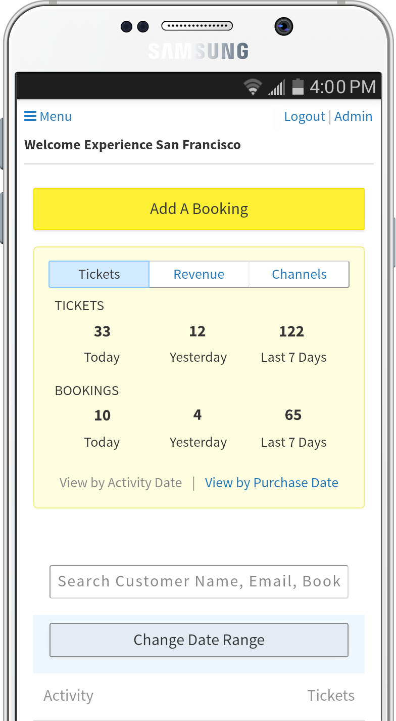
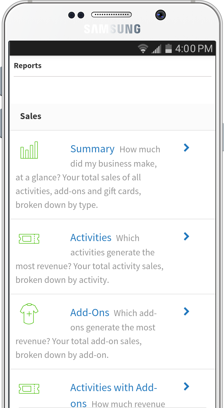
Last but not least, Peek Pro is responsive.
Peek Pro has it's own logo lockup and icon based on the Peek brand.
We picked Source Sans since it’s a Humanist font with a lot of character that boosts its legibility. It works well in small sizes with visible differences between commonly confusable characters: 1, I, and l.
All sound design systems need pattern libraries to streamline communication with product and development.
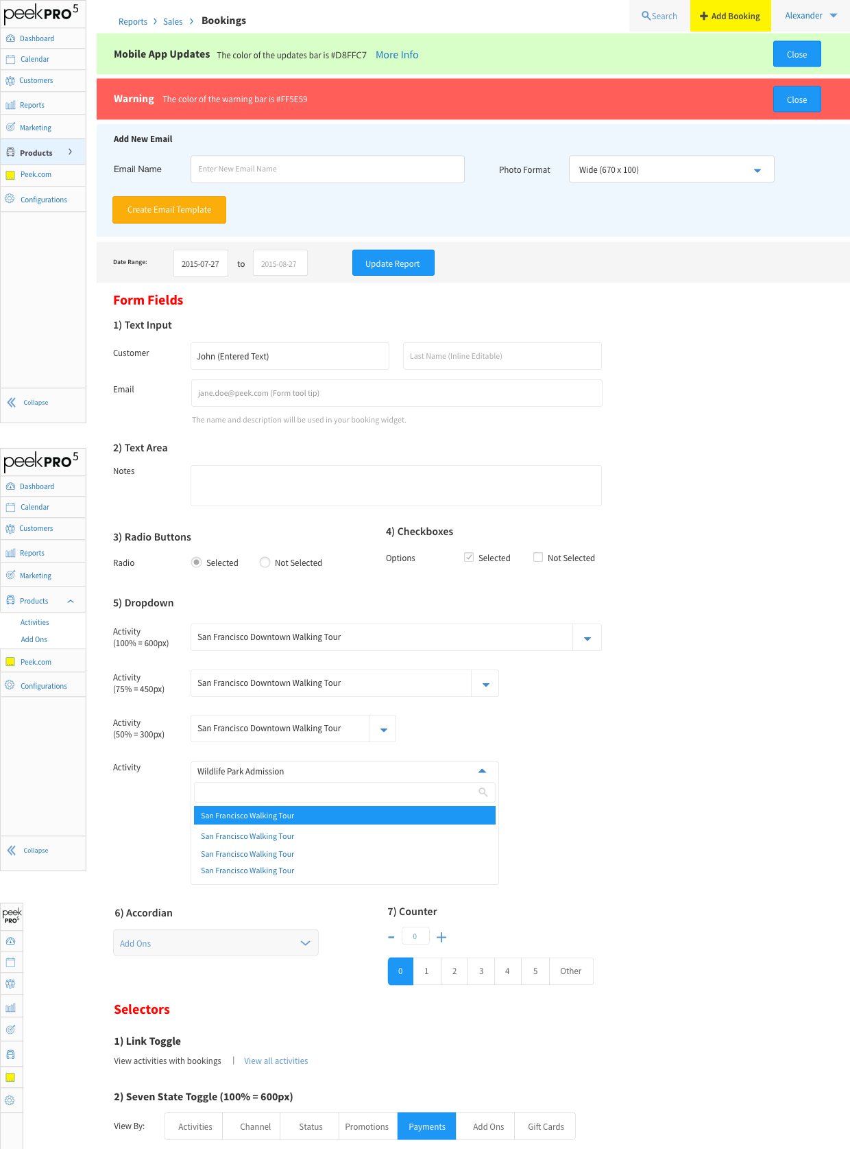
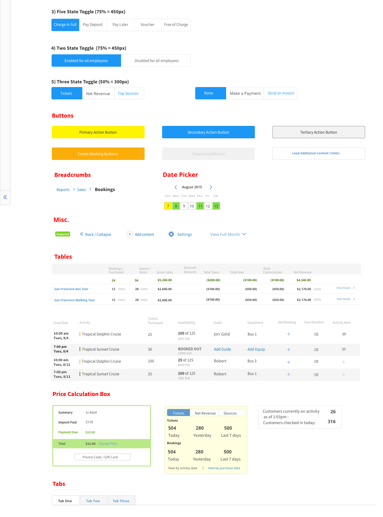
A key role of a product designer is to define a product and its interactions. For complex business applications, it’s essential to design for user preference. Supporting user preference propels a product from a tool to a day-to-day solution as our reviews demonstrate.
