
2015 – Current
Peek Pro allows operators to capture bookings and manage their back-of-house operations with a single Saas platform. Activity operators manage all aspects of their business including customer relationships, activity scheduling, employee assignment, and reporting sales.
The evolution of Peek Pro is a classic example of organic growth. The product started as an engine to power online booking for walking tour operators. It quickly evolved to support many different types of activity and tour businesses.
This use case required four pieces of functionality:
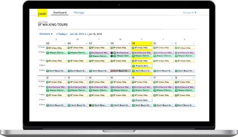
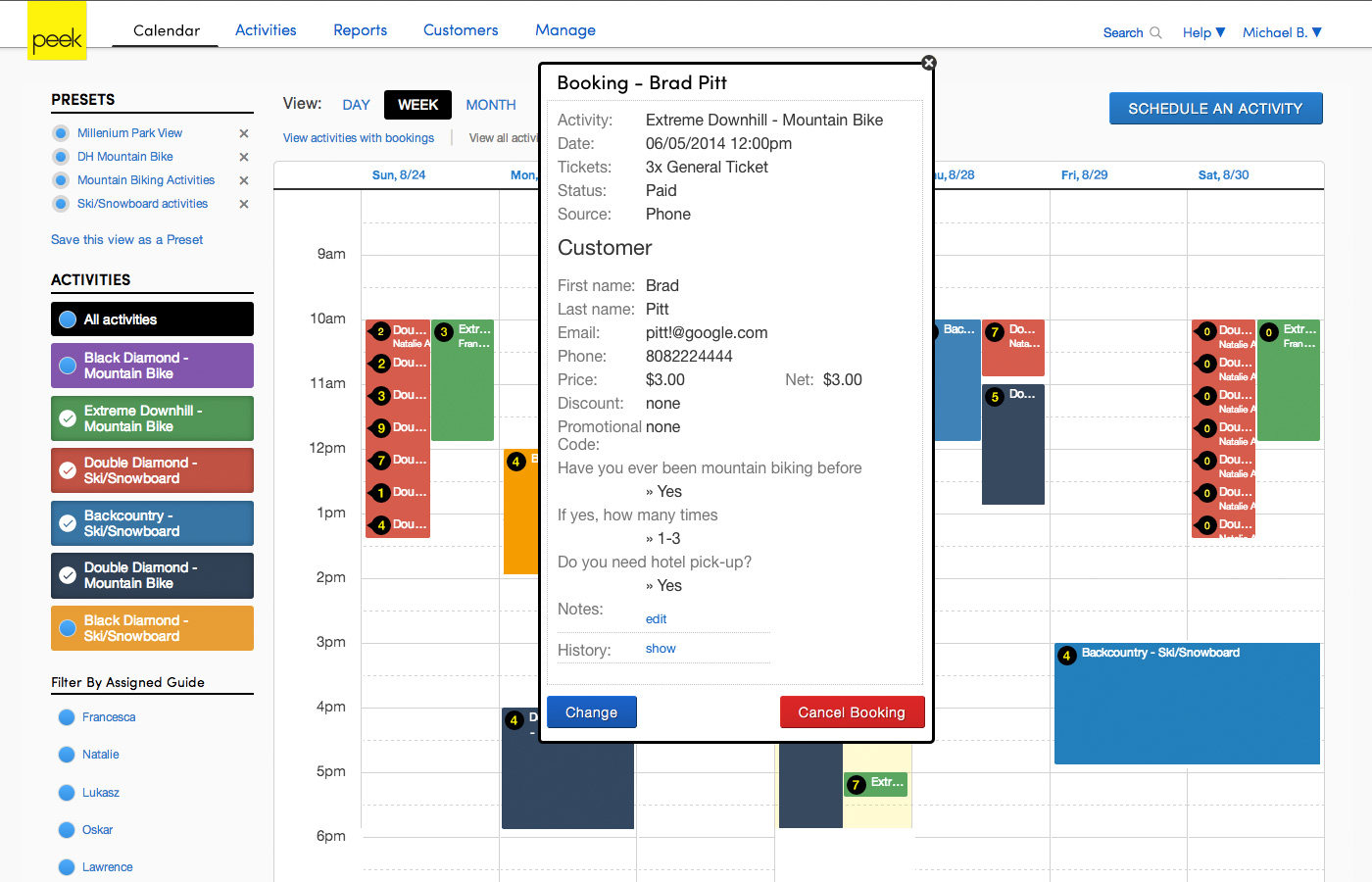
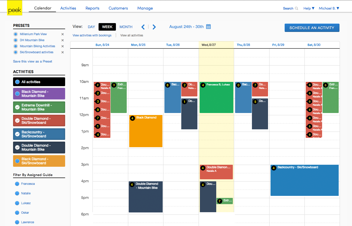
Initially, the Calendar was the core Peek Pro interface as it allowed operators to schedule activities and view bookings. Additionally, the activity and customer details were accessible through a read only modal. Calendar and modal quickly outgrew their functionality.
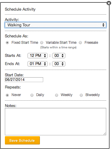
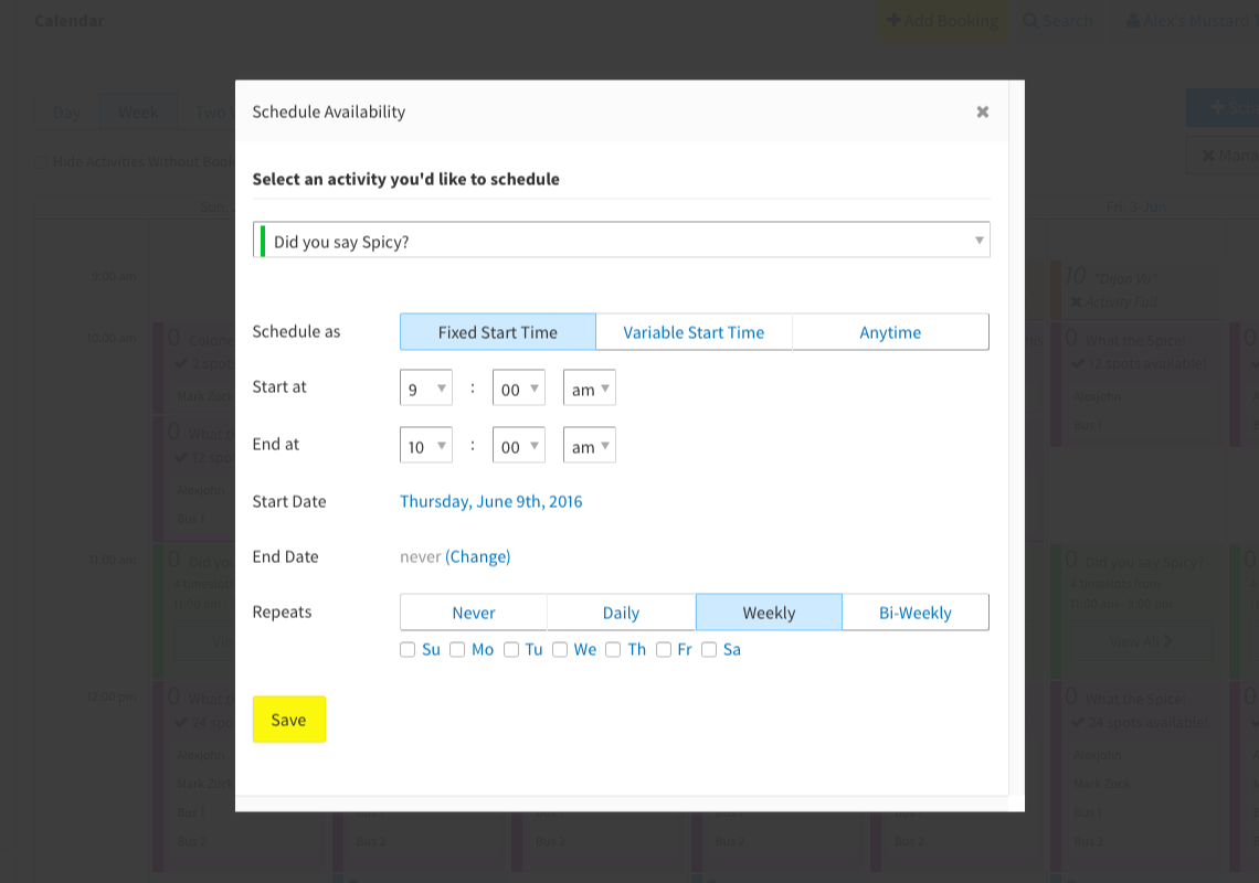
Activity Scheduling Modal
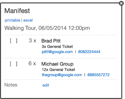
Activity Manifest Modal
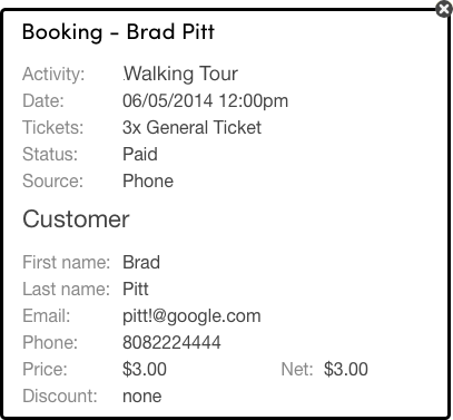
Customer Details Modal
Peek Pro rapidly expanded to support operators across many verticals such as bus tours, cooking classes, water sports, etc ... Peek Pro was no longer an engine for online bookings. Instead, it evolved to be the back-of-house software for activity operators to power their business. New features for this growth included:
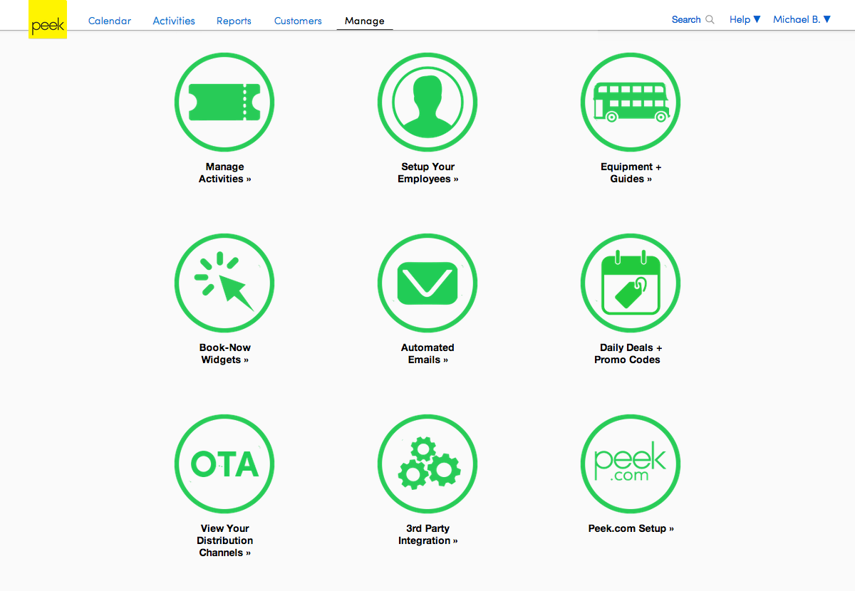
To incorporate the new features into Peek Pro, the Project Manager and I redefined the Information Architecture into five categories.
I refined the UI into a single design language with extra attention to the Calendar as it was the most trafficked feature.
1. Calendar
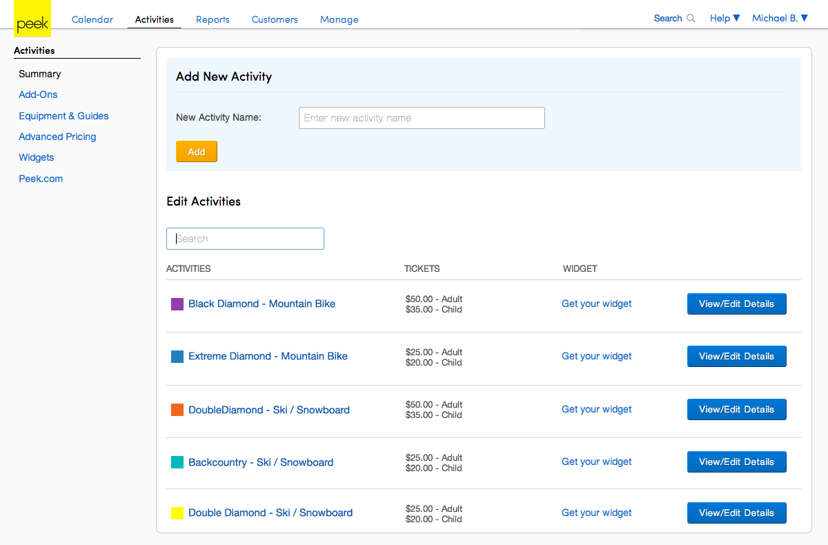
2. Activities
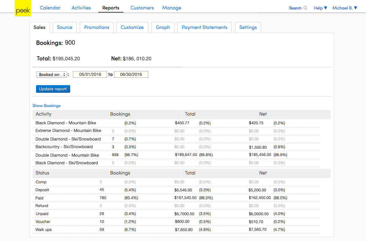
3. Reports
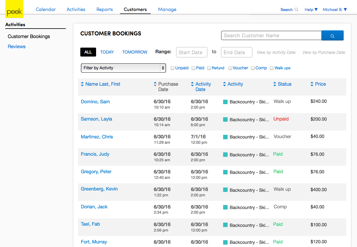
4. Customers
5. Manage
After we had delivered Peek Pro v2, the PM and I gathered feedback about our updated UX. A common piece of feedback was that Peek Pro is overly information-oriented and not task-oriented. We discovered that:
Instead, primary day-to-day interactions are:
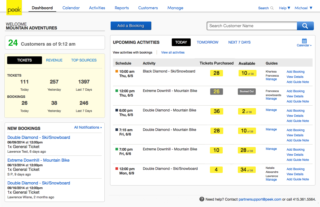
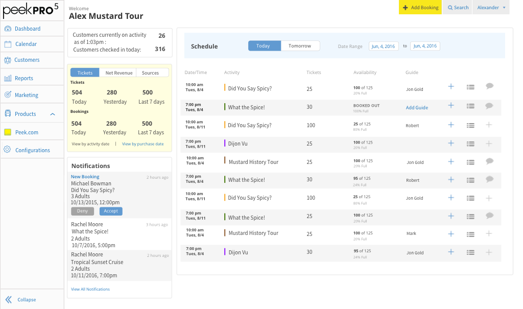
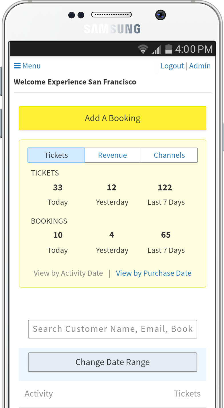
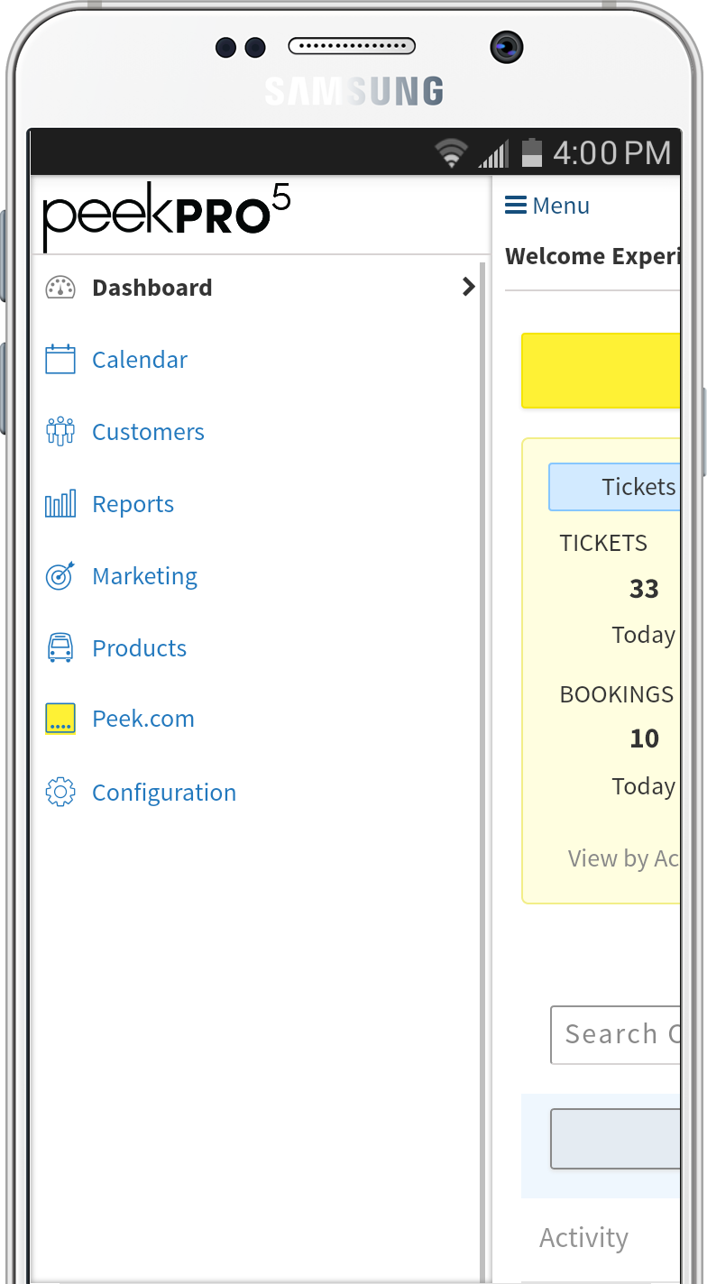
Peek Pro supported these interactions, but they were distributed across the app. Based on this feedback, we decided to group these core interactions into a Dashboard. Additionally, we augmented the Dashboard with quick snapshots of business health and bookings.
6. Dashboard
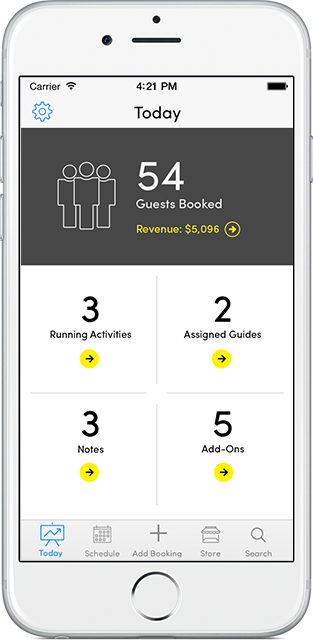
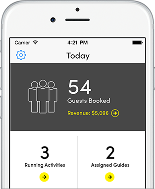
We received similar feedback for the iPhone app. We designed an iOS Dashboard too, more details in the iOS Dashboard use case.
As part of the Dashboard development, we audited Peek Pro. The result helped us pinpoint areas that did not scale well.
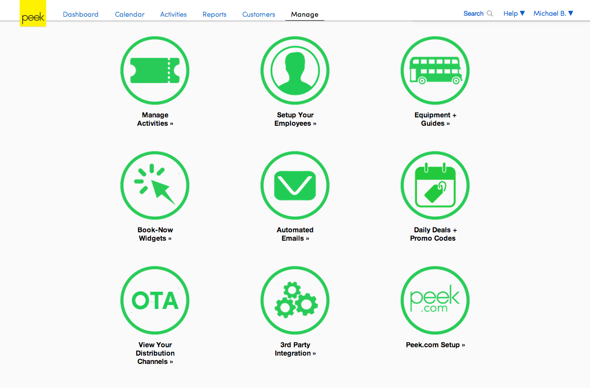
We discovered that our Manage section developed the Hamburger Menu problem, it became the dumping ground of features that lacked a home.
The horizontal navigation layout also proved to be a challenge as small displays did not allow adding more navigation.
We decided to revisit the IA, to extend Daily Habits framework into the entire product. Based on user research we divided interactions into three categories:
Daily:
Weekly / Monthly:
Quarterly:
Next step was to re-map the Information Architecture. Two junior designers and I started with Post-it Notes to keep the session fast and light.
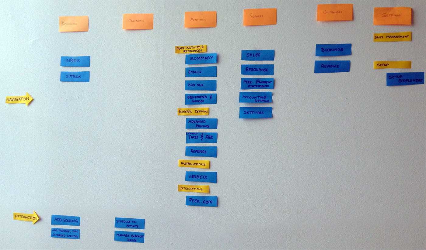
Before

After
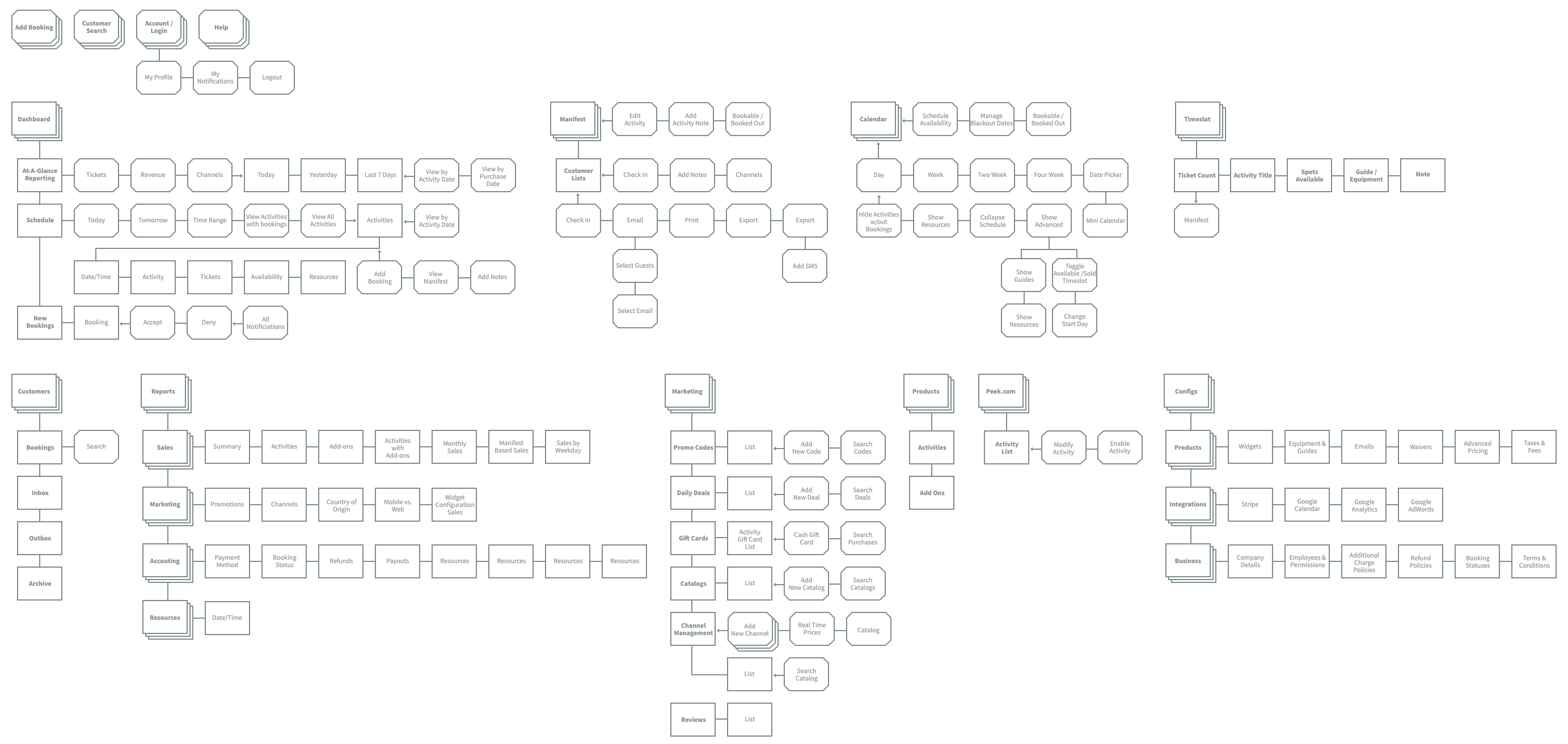
As displayed above, we streamlined the IA by focusing on tasks.
As a result of deciding to refresh the Product IA. The entire Product team (Designers, Engineers & Manager) felt it was time to put in place a comprehensive UX redo. Including:

The branding of Peek Pro was incorrect. The software was labeled “Peek Professional” but it used the Peek logo. As a kickoff for the UI redesign, I created a Peek Professional identity system.

We launched Peek Pro with Helvetica Neue. Helvetica Neue was familiar and it rendered well enough for web copy. Helvetica does not scale well for modern UI design of apps. Luckily, we now have new interface optimized typefaces. We tested:
We picked Source Sans since it’s a Humanist font with a lot of character that boosts its legibility. It works well in small sizes with visible differences between commonly confusable characters: 1, I, and l.
As detailed before, we redefined core interactions into three patterns based on user habits.
1. Primary Actions
We placed Primary Actions into a globally accessible Utility Nav. Since these actions are daily behaviors, we made their access universal.
2a. Primary Navigation
We redesigned the primary navigation from a top horizontal bar to a left vertical column. The left column layout allows us to add more sections vs. the horizontal nav.
We also prototyped interactions for the secondary nav.
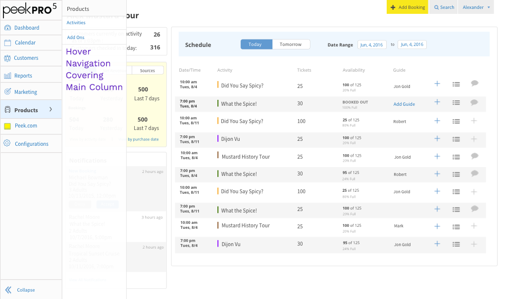
2b. Secondary Navigation on Hover
Failed as the secondary nav. covered primary content.
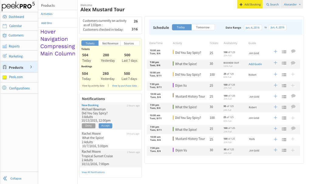
2c. Secondary Navigation on Hover
Failed as the secondary nav. compressed the primary screen.
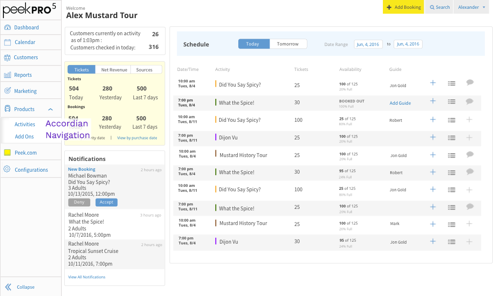
2d. Secondary Navigation as Accordion
Solved the problem of covering and compressing content.
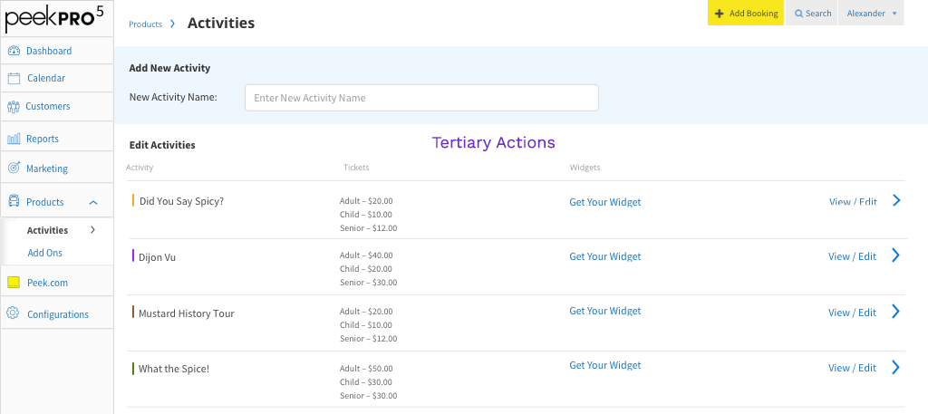
2e. Tertiary Navigation
Solution to tertiary nav. was to display tertiary actions as contextual navigation in the primary column.
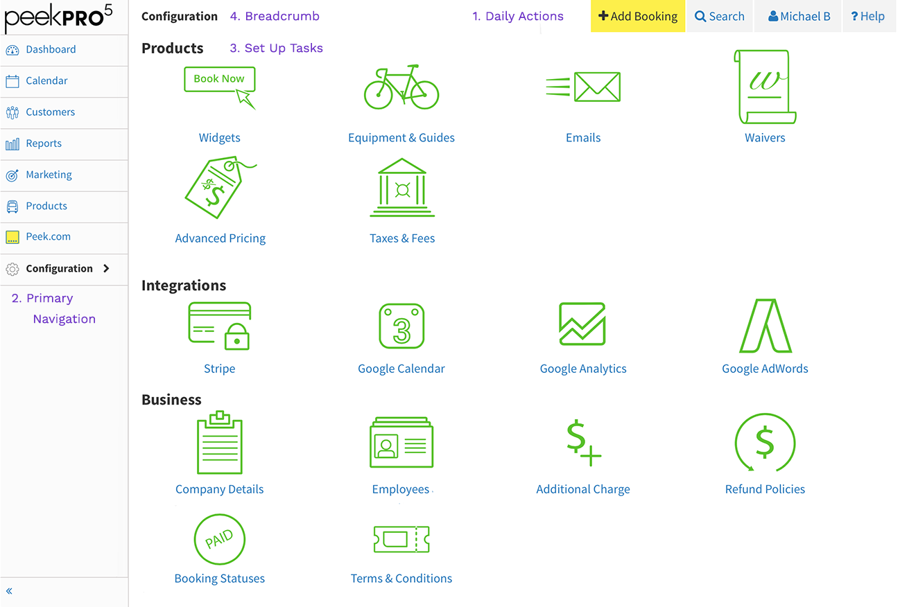
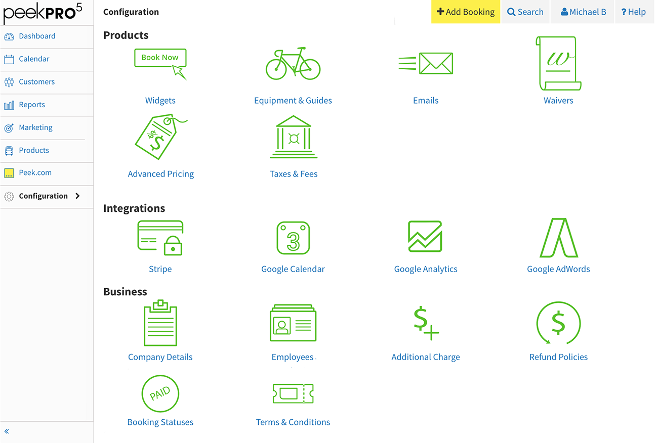
3. Configuration
Tertiary navigation adopted well to Configurations. Configurations section is an updated Manage interface but with grouped actions.
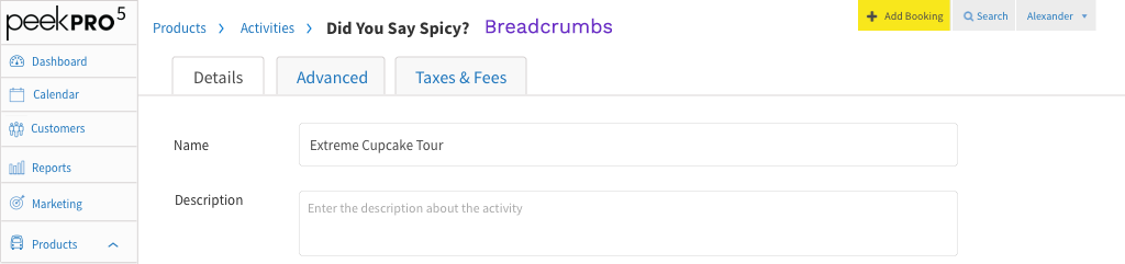
4. Breadcrumb
Since we always display page titles, I thought that we could make them into breadcrumbs. Breadcrumbs provide an additional navigation pattern.
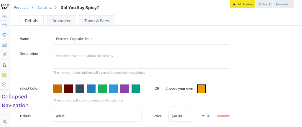
5. Collapse Navigation
Finally, we added a collapse navigation option to free up real estate.
With Peek Pro v5 we were able to redesign our modal windows. As the product expanded, the modals outgrew their capacity to handle rich interactions. I redesigned the modals to have a consistent UI that's flexible for most use cases.
Activity Scheduling
Activity Manifest
Customer Details
Schedule Activity
Simplified design patterns to accomplish complex scheduling.
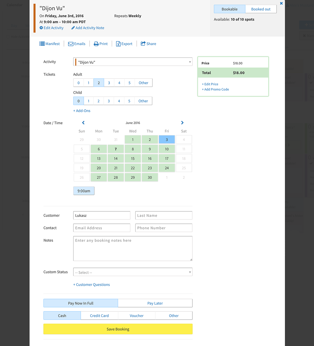
Add Booking
Single screen booking flow.
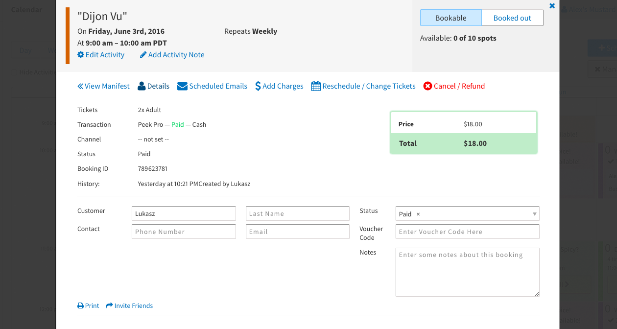
Customer Detail
Modify customer details without leaving the modal.
Reschedule Customer
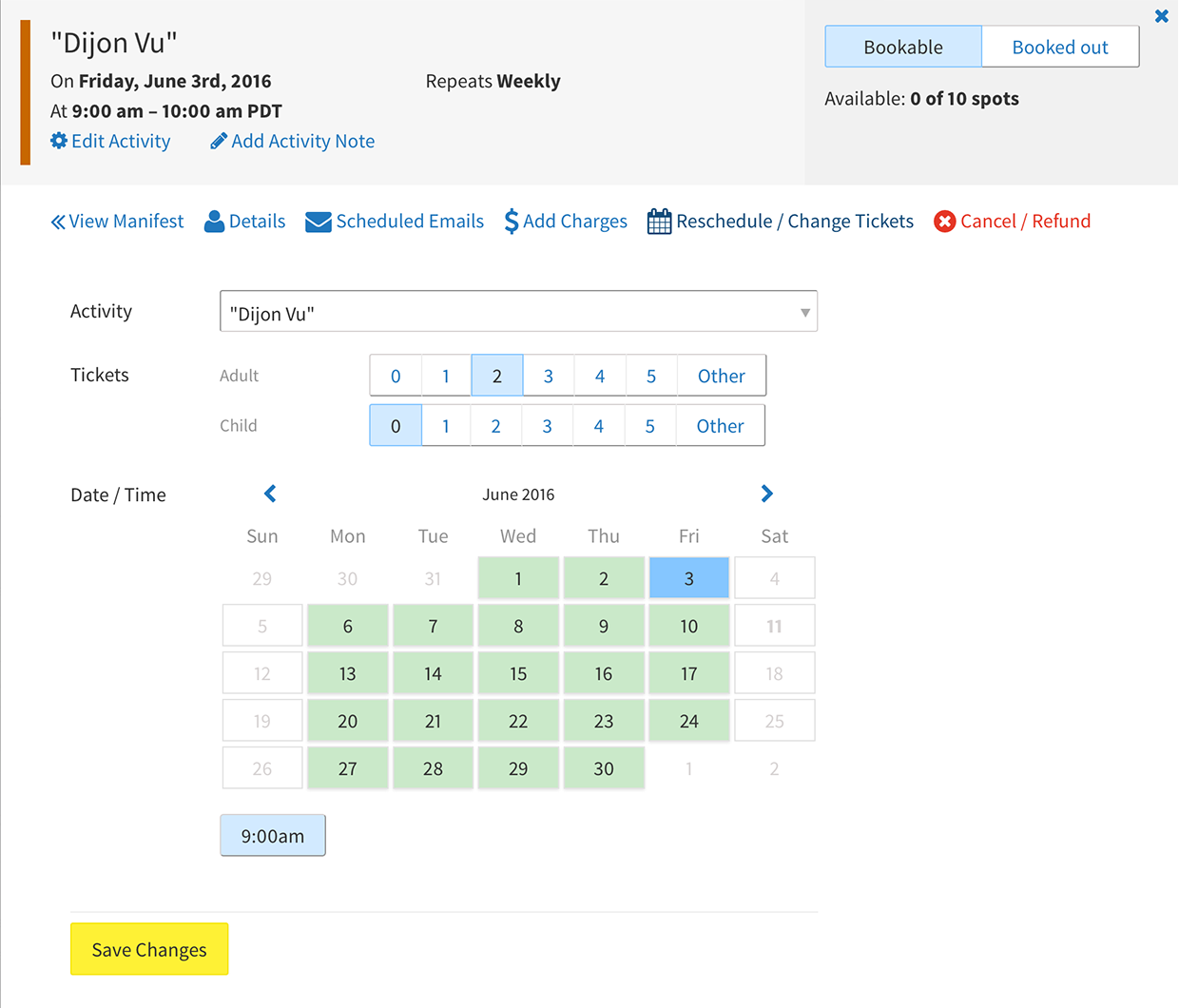
Cancel / Refund Customer
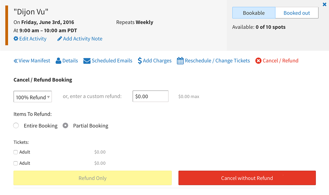
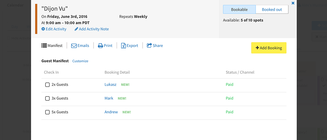
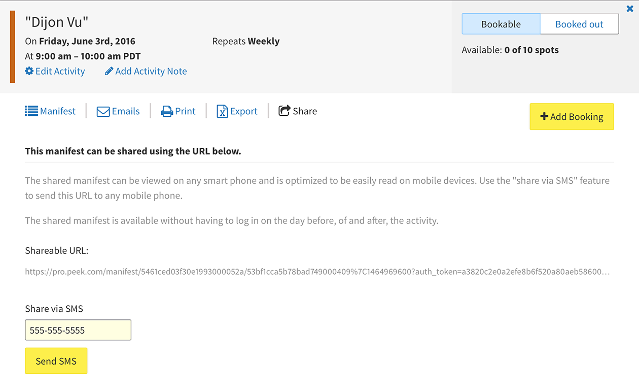
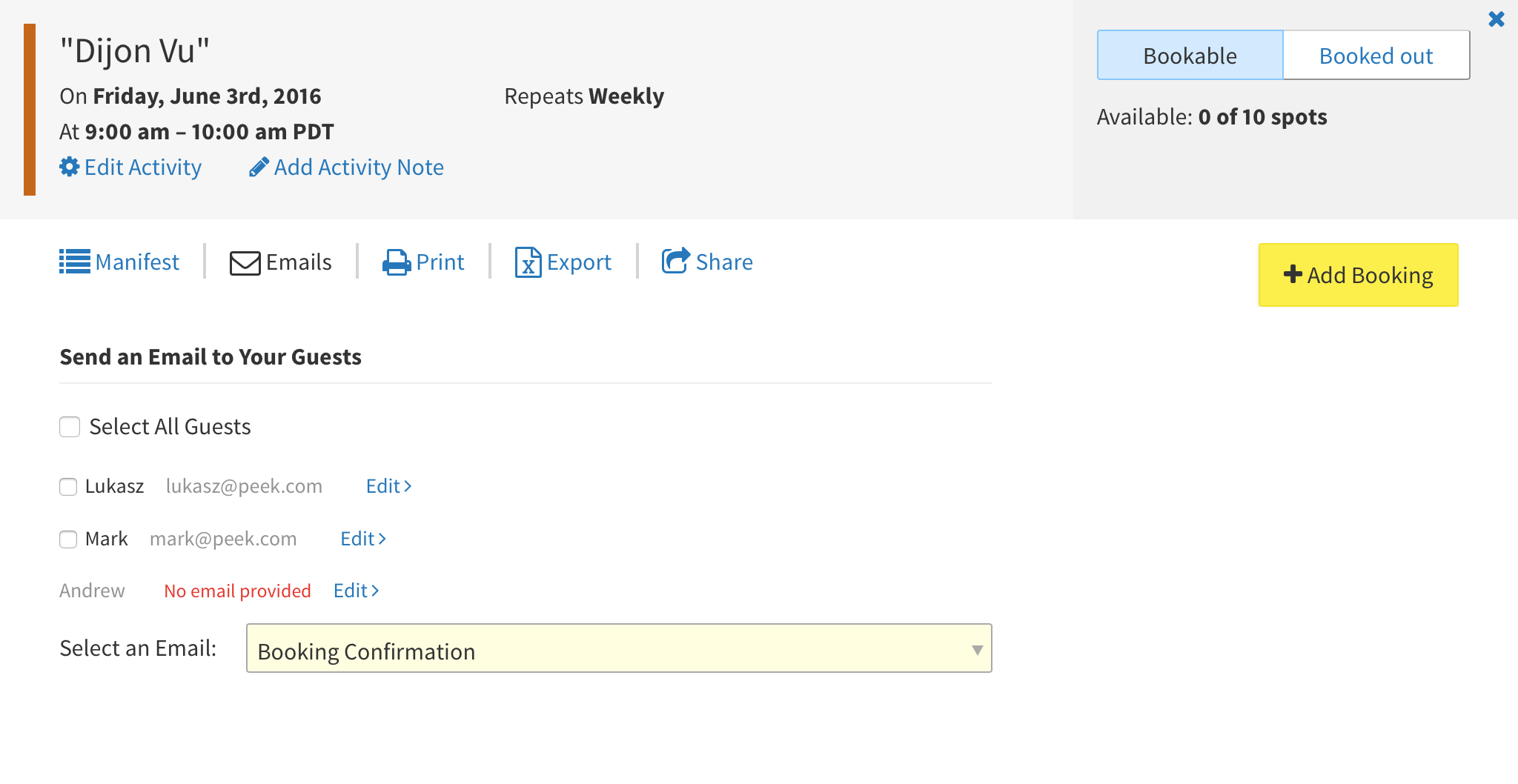
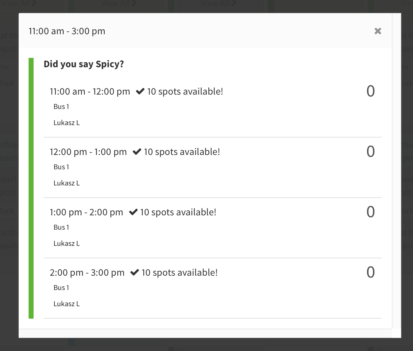
Manifest
View an activity manifest with multiple interaction options.
Share via SMS
Reach out via Email
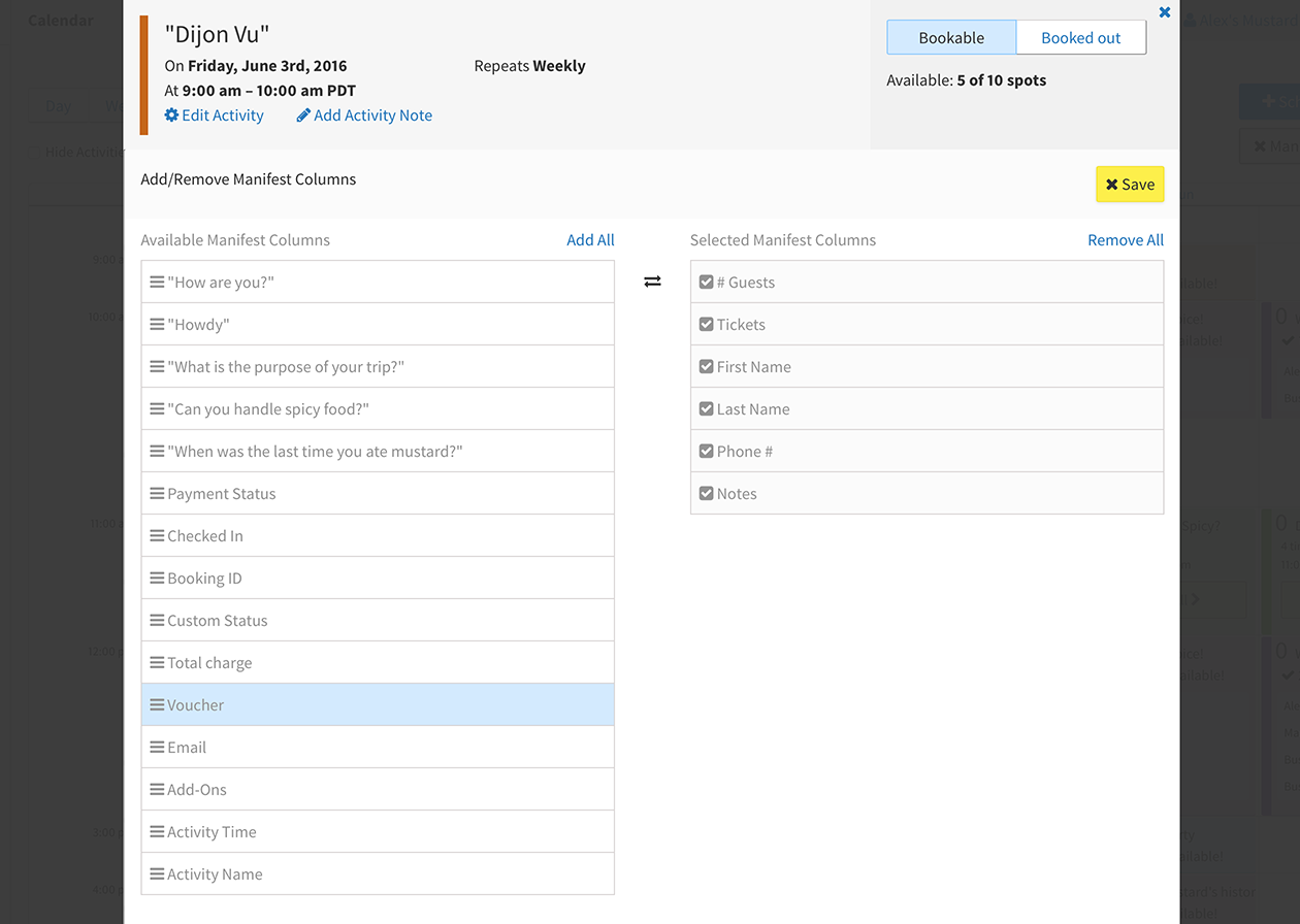
Customize Manifest
A popular request was the ability to customize our manifest. So we developed a drag-and-drop UI for operators to select and order fields.
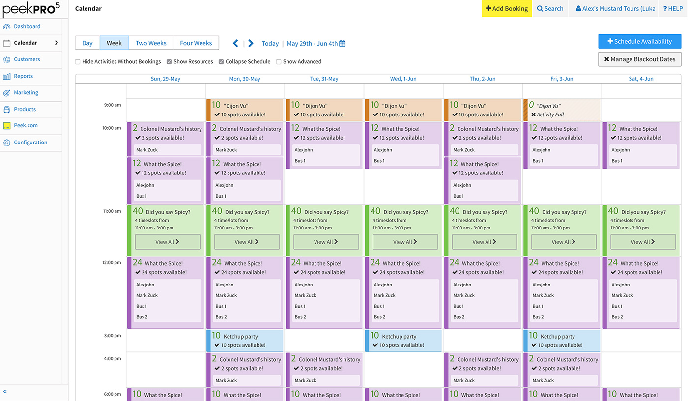
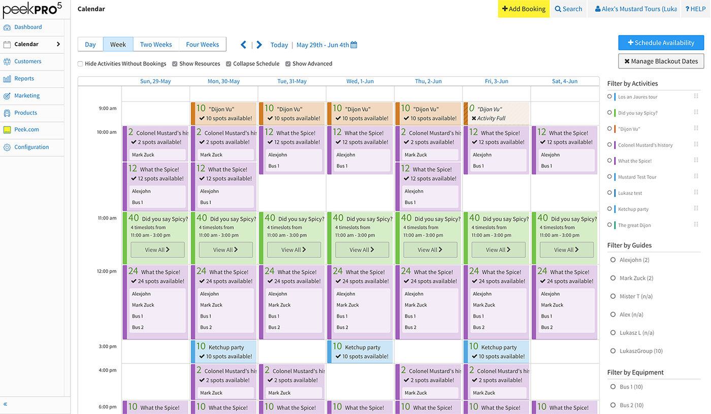
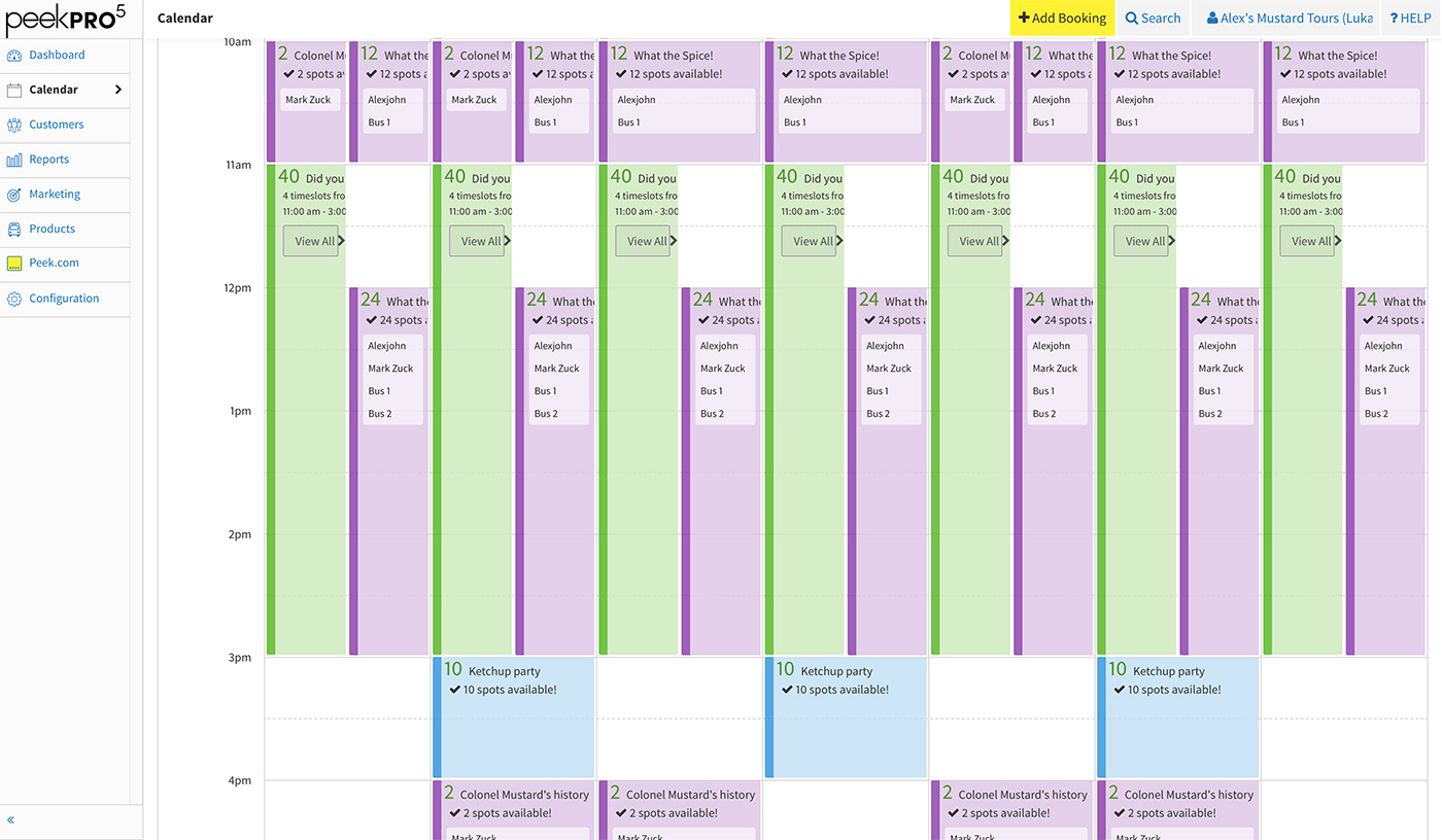
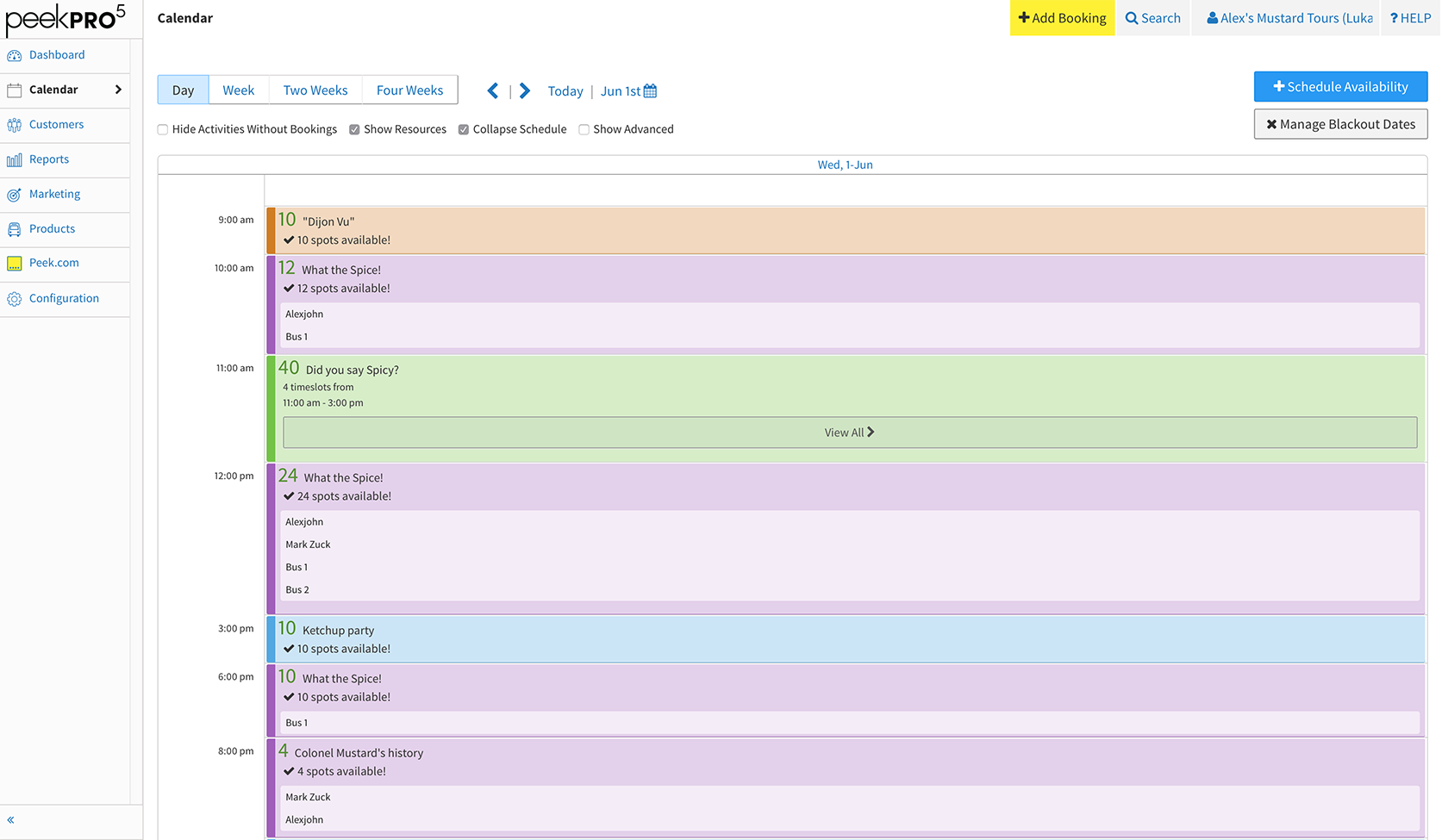
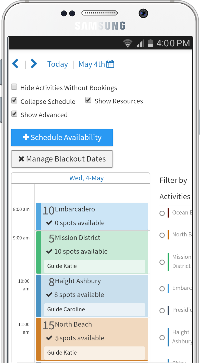
As part of the v5 refresh, it was also time to update the calendar. The objectives were:
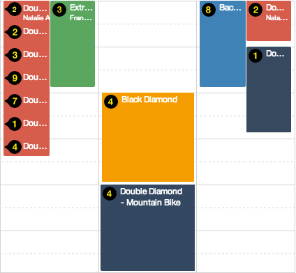
Previous Calendar
Refreshed Calendar

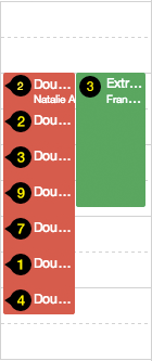
Activity Timeslot is an Activity Start Time

Activity Timeslot Refresh
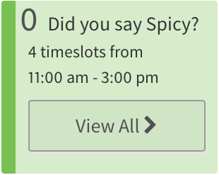
In the former calendar, Activity Timeslots only displayed activity title and number of guests. All other details were located in the activities detail modal. It became apparent as we on-boarded complex operators, that an Activity Timeslot had to display more details. To achieve this goal, I increased the legibility of the timeslot by reducing the background opacity and incorporating Source Sans. These two simple changes allowed us to add availability, equipment, and guide details into a refreshed timeslot.
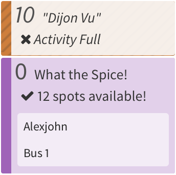
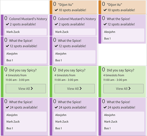
Booking Count / Guest Availability
We found that operators were split between viewing their activities by booking count or availability. We decided that the best solution is to allow operators to toggle their preferred view.
Available Guests
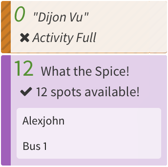
Booking Count
Advanced View
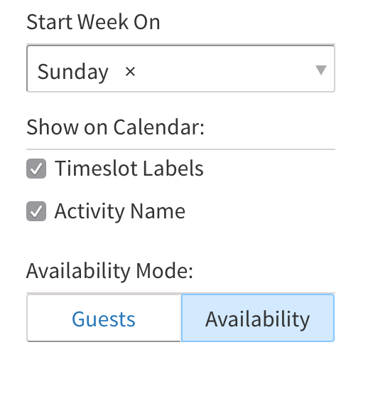
To maximize calendar width, we moved Advanced View filters into a right–hand column expanded by the Show Advanced toggle.
Preference Settings
Activity Length View
Previous iterations of the calendar displayed activities by duration. As we worked with operators with overlapping activities, the display by duration view did not scale. We discovered that we could show activities just by their start time. Activity by start time became the default view. We kept display by duration as an option.
Before
After
Before
After
Day View
Additionally, a subset of operators with busy daily schedules prefer viewing a single day at a time.
Variable Timeslot Refresh
Activities with variable start times at 15 min intervals were an ongoing Calendar display challenge. With activities by duration, we showed variable start times with a repeating vertical tick. Once we collapsed to start time, we were not able to display the ticks. Luckily, since we just refreshed the modal, we used it to show variable start times.
New Variable Timeslot
Previous Variable Timeslot
A key engineering decision of the v5 redesign was to rebuild the front-end as a single-page application. The engineers rebuilt Peek Pro with React allowing it to be responsive across a broad range of devices.
View Schedule
Add Bookings
Check-in Guests
Manage On the Go
Run Reports
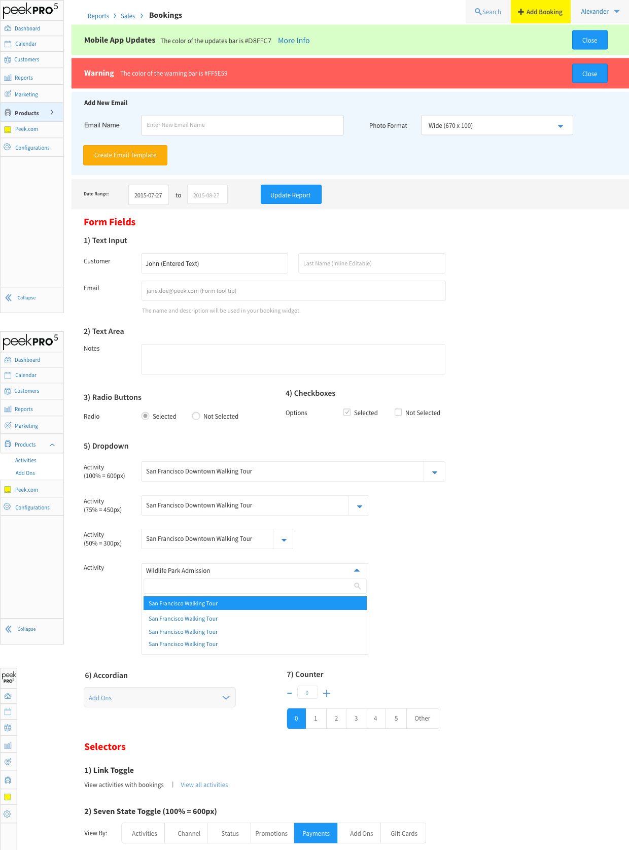
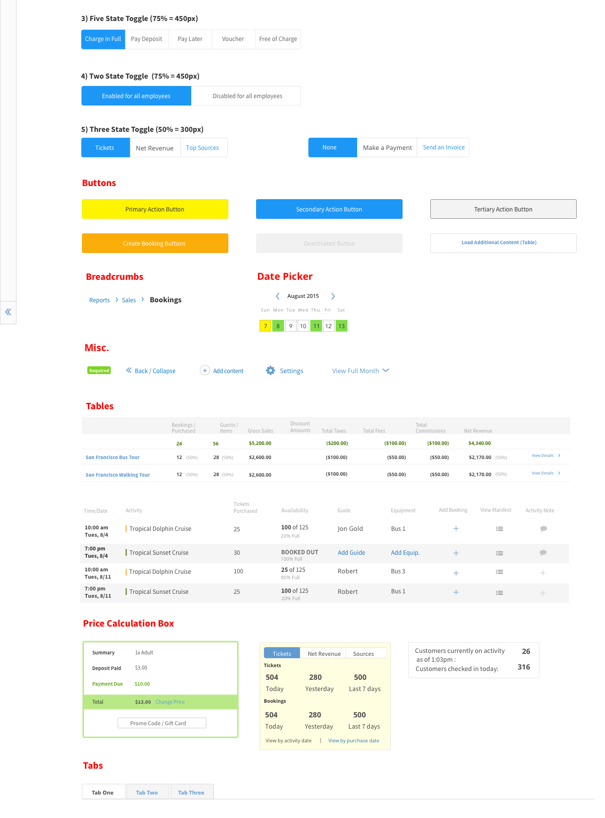
As part of the process of developing PeekPro v5, we designed the PeekPro pattern library. The pattern library is a set of agreed upon design and interaction conventions. The document allows anyone in the Product team to conceptualize or create interfaces without designers creating all the design artifacts. It’s a living document that changes as we develop new features and change existing ones.
Designing systems and tools is a challenge. It requires the constant practice of empathy. Many Peek Pro customers are small businesses, and some are real mom-and-pop operations. Peek Pro powers their livelihood, and every design decision impacts their bottom line.
As I designed Peek Pro, research became the center of my process. To scale our business, we incorporated larger operators. As such our feature requests became more complex. Research became the key tool to understand new problems and solutions.
I validate new products by hands-on user-testing. I iterate with whiteboards, wireframes, and prototypes. The goal of user-testing is to confirm that a potential solution is a considerate design.
Designing complex back-of-house tools also requires deliberate UI design. Peek Pro operators don’t have time to (re)learn interaction paradigms. As such it’s crucial to design the UI to be consistent with predefined interaction patterns.
A final takeaway from designing SaaS business applications. The role of the designer is to define a product and its interactions. Yet for complex business applications, it’s important to design for user preference. The role of the designer is to define the core interface but also allow users to customize features to their needs. Designing to support user preference, propels a product from a tool to a daily habit.